Sunday 6 December 2015

My friend and colleague

Since I last posted, Kenn Pearson, for whom I acted as election agent in the 1987 General Election, has passed away at the age of 75, having been in serious ill-health for some years.

I noticed today that Mr Abdul Mateen, of Cowes on the Isle of Wight, who stood against Kenn in his Council ward, has paid tribute to him in the County Press, the island's local newspaper.  I wonder how many former candidates would do that - but then, Kenn could unite friend and opponent: he didn't make enemies; he was too nice a man.

I found a drawing I made of Kenn which must date to round about the time he stood as Labour candidate for the island - I don't remember why I did it; perhaps it was intended for a leaflet, though we went for photographs in the end.  Perhaps the reason why will be obvious but, for better or worse, here it is.


Wednesday 18 November 2015

And we are 65!

Oh goody....................


Tuesday 10 November 2015

My page on the NAPA website

http://www.napauk.com/robertphillipjones.htm

Monday 2 November 2015

Robert Phillip Jones, NAPA!

I'm very pleased to announce that on October 29th 2015, I received confirmation that I have  been accepted as a full member of the National Acrylic Painters' Association (NAPA).

In his advice, the Director said:

"The selection committee thought your work was well controlled whilst being direct and expressive.  It also shows a good use of natural colour and composition.

"Your work is interesting in terms of both technique and content and we think it would make a positive addition to the work displayed on our website and in our annual exhibitions."

I should shortly be seen in all my glory - well, some of it - therefore on www.napauk.com.

And don't forget my website - still under construction and renovation - at www.isleofwightlandscapes.net.   Ignore the chaotic gallery page for the time being, there are three other pages for you to savour, including - and how CAN  you resist? - my Buy page, which has a selection of current work still available.

Wednesday 14 October 2015

The Green, Niton Undercliff,: Sea Defences

This is a quarter imperial watercolour - rock armour protects this part of the coast, but was never installed further along: perhaps that's one reason why the Niton to Ventnor road, Undercliff Drive, collapsed, and why it'll take more than patching it up or diverting it to ensure its future stability.

The spirit of the thing is accurate, but I don't go for images that could be photographic - there's the camera, if you want those, after all.


Saturday 3 October 2015

Goodbye, Denis

Denis Healey - that was a life well-lived, and you'll be missed: politician, photographer, painter, soldier, and brave man.

A unique combination of intelligence, wit, and sheer guts.  Rest in peace, Denis - you were just about the last of the great figures of the last century, and an inspiration in this one.

Saturday 26 September 2015

Candlestick Tree, Niton Undercliff

This is an 8" by 10" oil, just a sketch of the huge candlestick tree - I think it's a Sycamore - it could hardly be anything else - that has grown into three great boughs of roughly equal girth until they branch out about half way up.

I've had four paintings so far from this one walk down the road, 3 oils and 1 acrylic.


Friday 25 September 2015

Inside Elephant Hole Cave

Acrylic, 8" by 10"

A quick study from memory, because drawing inside the cave was impossible (not least because I forgot to take a pencil with me....) and so was taking a photograph.  Having got in, the worry was whether I was going to be able to get out again.  The point from which I would have been standing in this one is where a tunnel leads through the cliff to another opening which is almost impossible to see from the outside.  I got through that, but the path was so treacherous that unfortunately I had to turn back the way I came.

Well, I can say I've done it now, anyway: I'm in no hurry to do it again.  I just hope that road works which are likely to be undertaken in the area don't destroy this part of the cliff and its environs forever.

Cripple Path II, and Elephant Hole Cave


A couple of recent oils - the top one is another version of the Cripple Path, from the cliffs down to Undercliff Drive near Ventnor - and I think it's a bit cold: I may add a warm glaze (of transparent oil colour) in places.

The second is of the quite remote Elephant Hole Cave, also off Undercliff Drive.  This, in the appropriate season, is the home for rare bats - there is some concern locally that the road will be diverted all too near to this site, disturbing the bats and destroying a unique bit of landscape which, once gone, can never be replaced.

Sometimes any painter must feel like the Yorkshire artist John McCombs - getting to these places just before the bulldozer.

Saturday 12 September 2015

Cripple Path pastel sketch

I don't do pastel, other than in sketches for paintings, and I don't do it for public consumption because I'm not very good at it.

I had rather resigned myself to this, and to using pastel merely to take colour notes and to help me "read" a scene before painting it.

However, here is one - not a great work, but presentable; it sort of works.... whether I shall experiment further with pastel I don't know, but it does appear that - at last - I might even be getting the hang of it.

This is a path from the top of the cliff down to Undercliff Drive in Niton Undercliff - the broken road between here and Ventnor.  The term Cripple Path is said (by some at least) to derive from water courses rather than disability, but as yet I've been unable to determine the truth of otherwise of that: what I do know is that I could only get half-way up the path before having to turn back - it's just too steep, and too slippery.  This view is of the last part of the path before it meets the road.

I've just painted it in oil, from a somewhat different perspective - it's a work in progress at the moment, though - not sure about it as yet .....

Wednesday 26 August 2015

Acrylic comparison, and a new watercolour (when I said I'd stop..)

Here is a (Chromacolour) acrylic version of the not very good watercolour below - just to show the comparison between the two media, and that acrylic can be used in what Alwyn Crawshaw called a "watercoloury way".


From Headon Warren to Tennyson Down.

I'm not sure this is really finished, frankly - but while it's a bit more topographically accurate than the watercolour version, I got a bit bored with it.  Looking at it in thumbnail proportions prior to posting, I think it could do with darker tone in the greens in the right middle ground: but that would have brought about several more problems in relation to the fence and the purple of the heather, and on the whole - well, I wasn't in the mood to do much about it beyond this point.  So it'll have to stand as is, or go down fighting.

And although I swore I would take a temporary rest from watercolour, I got a tube of Pthalo Blue from Jackson's, and had to try it - from which grew another painting: see below......

By the River.

Quarter imperial watercolour  (ie, 15" by 11").  I hadn't intended to paint this at all, just to try out the Pthalo Blue, but it's such a gorgeous colour, and mixes so well, that it grew under the brush.  For good or ill.....

Sunday 23 August 2015

Two rather dull paintings - We must move on!

The problem with remaining stuck in a groove is that the quality of one's work doesn't get better through sheer repetition but tends to slide downhill.

These are two that slid.

I don't believe in hiding the duller stuff from people, because with any luck we can all learn something from the ones that didn't come off - possibly rather more than we learn from those that did.  And you never know, somebody may have a higher view of these than I have: if so, don't hesitate to make me a foolishly generous offer for them.  I'll pack them up with devoted care and speed them to  you.  But if these were by anyone else, I'd find them dull - and in both cases, the composition is the big problem.


In this one, for instance - which started out as a watercolour but has had a bit of work done  ( not plastic surgery, but a touch of ink and coloured pencil) - we've got a rather unexciting subject to start with, made worse by that lump of blue sea which just isn't doing anything.  I don't think that composition was ever going to work, and the fact that it looks a bit like a stage-set isn't helping: it looks like scenery, rather than a scene, if that makes any sense.


The second one, which is all watercolour, is perhaps a little better -  the reason I'm disappointed with it, though, is its departure from the actual scene;  the distant downs are nowhere near as prominent, nor as symmetrical, as I've painted them.  It was, to be fair to myself, a test piece on which I tried a brand of watercolours new to me (daveliou: made in China, available on Amazon.  The paints worked fine, once I got used to them - this isn't the place to go any further into that, but you'll find my review on Amazon UK if interested).  It's also a bit on the "tight" side - a freer hand with the brush might have paid off here.   The distant buildings are out of proportion, as well, giving a slightly weird impression of scale: it would have been better to have left them out.  

Thing is - one lives and learns, all the time: if you make a mistake in watercolour it will show because it's very hard to conceal it; certainly, if you make a mistake right at the preliminary drawing stage, you're on a loser with watercolour because there's so little you can do to put it right.  Better to scrap the drawing and start again: the trouble is, one doesn't always notice at that stage.  Which is a good argument for making lots of sketches and studies before you ever get round to pulling the paints out.  

I've taken watercolour about as far as I can at the moment, certainly on this paper (Fabriano 140lb).  Flogging away at it isn't going to help, so I've bought some more Chromacolour acrylic, and will be painting in acrylic, and oil, for a while.  I'll certainly come back to watercolour: but I need a rest from it for a few months.  (Trouble is, it does tempt you back!)

Friday 7 August 2015

Two More

Idleness being foreign to one's nature - pause for mirth - I have two more watercolours to offer: one being rough and, I think, energetic, the other involving a complete change of palette - I watched one of Charles Evans' demonstrations on YouTube the other day ... I know he's an artist who demonstrates on behalf of Winsor and Newton but I think his comment that you  should only ever use artists' quality paint is right: I've been experimenting with some other brands recently, and next to W & N artists' quality they just don't work.....

You might wonder why not - it's true that a good painter can make use of just about any materials, from student quality paint to tea or coffee used as dilute ink.  But while cheap and cheerful materials are easier on the pocket in the short term, they just make life so much more difficult that it takes a lot of the pleasure out of painting.  Colours aren't intense enough - paint has a sluggish tendency and pronounced unwillingness to spread on the paper - and to cap it all they fade.

Good paint makes good work possible: it doesn't make it inevitable, but at least you're giving yourself a chance - working with inferior materials, be that paint, brushes, paper, canvas, just makes the job so much harder than it need be: and in the end, there's no saving in that.

Use the best you can get.

The Broken Wall I -
ignore the gum strip at the bottom!  Must invest in a few mounts....  This is the rough and energetic one.

The Broken Wall II -
And this is the different palette: principally in terms of the yellows; I've not used Lemon Yellow for some time, but employed it here; and I also used Venetian Red rather than Burnt Sienna as my red-brown.

Thursday 30 July 2015

I'm working - and so is the new computer

It has been a fraught few weeks, but I now have a new computer - well, pretty new; new to me - with Windows 7 and an option to upgrade to Windows 10.

Settings are all sorted,passwords retrieved or remembered, contacts located, files found.  I even plugged everything into the correct sockets, first time round.   And they said I was old and senile!  Ha!

I did panic though.  Just a bit.....

I am currently working on some more paintings, and drawing again, after at least a week of producing nothing but muck sweats, and despite the fact that cervical spondylosis (arthritis in the neck) is making my arms feel like someone else's.

If you happen to have a cure for CS that you're sitting on, therefore, do not hesitate to share it with me.


Wednesday 15 July 2015

My Annual Computer Crash

Every year, at about this time, my elderly computer crashes, with the loss of files, programmes, and, in the latest one, about 1,000 emails.

So, if you've emailed me in the last week, would you please re-send?  Same address as always.

(And if you could also send me a new computer, that would be very welcome: I shall have to dip into the wallet, I fear - it's taken me nearly two days and a good deal of one night to recover, to the extent I have, and I shall have to accept that the old bucket, and the wretched Vista Home Basic, are trying to tell me something.

Remembering the fire that destroyed Puckaster Close, just yards from here.  

Thursday 9 July 2015

Niton Undercliff, Isle of Wight

Still working with watercolour at the moment, and trying to get the Fabriano 140lb paper to work for me.  Fact is, I need a heavier weight.  The only way I can make this paper work at all is wet in wet, and stretched with gummed tape to prevent it buckling.

Bockingford paper, in fact most 140lb papers, buckles - but I've never known a paper to turn into corrugations as reliably as this one.

However, just goes to show I should spend more on paper, and hang the electricity bill....

This one is Early Morning, Niton Undercliff.  Threatening clouds, light gleaming through, a couple of yachtsmen about to lose their breakfasts...

(Quarter Imperial size, unframed)

Friday 26 June 2015

Isle of Wight Open Studios

Well, I fear I can hardly open mine, because I work from my humble flat: and when I say "humble", you can take that as a euphemism for "squalid": also small, pokey, hard to get to...

Nonetheless, it's always more or less open to anyone who happens to be in the Niton Undercliff * area and feels like calling round; and there's usually something to be dug out of storage to delight the connoisseur, punter, customer, or person who's just feeling the urge to spend.  I take cash, cheques - with a bit of proof of identity - and cigars.....

And here's a few of the latest, although three of them have already gone.


From the top - drawing of Dracula's Castle in charcoal, pigment ink pen, and Chinese ink; Watercolour of trees at the roadside, on the old Blackgang Road; Pensive Fox in Chromacolour acrylic, and Dormouse ditto - the bottom two combine opaque and transparent acrylic, plus a bit of texturing in the lower picture - proving that you can use salt with liquid acrylic just as you can with watercolour.

* If you can find St Catherine's Road, along which is situated the Buddle Inn, you'll find Castlehaven Lane branching away from it and taking you, ultimately, to Reeth Bay.  Half way along the lane is Reeth Lodge, behind big stone pillars; wander up the drive, past a cottage on your right, another on your left, until you come to a farm-type gate, with a smaller gate to its side - and beyond that are the delights of Reeth Lodge, myself, and a small border terrier which is tolerably friendly and hardly lethal at all......  

I just don't know how you can resist..  

Saturday 23 May 2015

Trees on a Misty Hill

I've had a somewhat fallow period since the General Election, on which comment would be painful, so I shan't make one.  Struggled with a few things, including a few watercolours, but the only one I think fit to show is this one - used a bit of salt, which has given it a misty quality I found reasonably appealing.   I've been using Fabriano paper, instead of my usual Bockingford, Arches, or Saunders .... not getting on with it too well at the moment, although it took the salt and water well.

I'm having a bit of trouble with inspiration just now, but trust it will return eventually.   Probably a good thing to have a bit of a rest from painting now and then - it gives you a chance to have a think about what you're doing.

Anyway, here's the one thing I've painted for a week or so....


Friday 1 May 2015

Watercolour More Difficult than Oils?

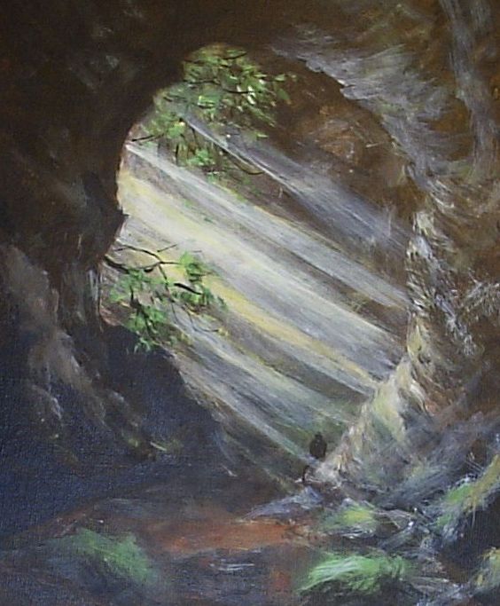
Well, not really, no.  Watercolourists might like to think so, but provided the watercolour is planned, and you realize you must work from light to dark, it isn't that hard.

BUT - watercolour can't half go wrong!  (I speak with feeling: mine just did.)  And if it does, there's very little you can do to rescue it - actually even that's a half truth.  You can do a lot by overworking it with pastel, or with opaque acrylic - Chromacolour acrylic is one of the best for this (update that website, Chromacolour .... you said you were going to months ago).  But of course once you do that, you don't really have a watercolour any more.  People may, and often do, pretend that acrylic paintings are really watercolour, because they're painted with water, but we all know that's a little fib.

Or a whopping great lie, depending on preference.

There are water-soluble oils available now: are THEY watercolours too?  Pull the other one.

So if a watercolour turns turtle on you, and you don't want to turn it into a mixed-media work, you've not much choice other than to bin it.  But that's just a feature of the paint and the technique: it doesn't make watercolour painting intrinsically harder than any other medium.  I've sweated more blood over oil paintings than I ever have over watercolour, even given the number of the latter I've torn up into little pieces while using language mother never taught me.

And there again, there are those who insist on "pure watercolour", by which they mean transparent paint with no body colour - white, in other words - mixed with it.  You have to wonder how far they're prepared to take this - there IS body colour in a number of watercolour paints; some are just more opaque than others: eg, Light Red; the Cadmium colours; Turner's Yellow; Naples Yellow; Venetian Red.  Would the "pure" watercolourists argue that these aren't pure watercolours?  When, anyway, did pure watercolour - which I take to be the use of transparent single pigments, really - become a mark of refinement and distinction?  Turner, Constable, Palmer, Cox, Cotman, Girtin, used whatever came their way to achieve their paintings: it's not a method sanctioned by time and custom - it's just that at some point I've been unable to trace, someone decided that the traditional English watercolour was actually nothing like traditional English watercolours, and instead invented a "classic" form of the medium entirely based on transparent washes on white paper.

It would be interesting to find out who it was who began this tradition - I suspect it's very much a 20th century phenomenon.

As it happens, I love a transparent watercolour - clear, clean washes laid over the paper, minimal colour mixing on the palette, colour dropped in to other colours to achieve optical mixing.  But I could do without the hint of snobbishness about the method - as if it's the "right" way to paint in watercolour.  It may be right for you, but don't erect a fence of prissiness around it and look down on other (and actually older) methods, the while assuring everyone how "difficult" it is.  The technique is hit and miss, that's all: that makes it infuriating at times, but no harder than other media - painting is quite hard: if it weren't, no one would waste their time on it.

Tuesday 21 April 2015

IsleofWightlandscapes.net Updated!

Well, there's an error on the Gallery page - images are pixellated - but at last I've managed to upload my new files to the Buy page of http://www.isleofwightlandscapes.net.   So take a look - and better still, BUY something.

My new 24" monitor helped, because my vision is poor, and I must record my thanks to 3iX web-hosting, and the Serif online web community, for a LOT of help.

And now, flushed with success (but determined to fix the errors later) I'm off to bed - where I shall sleep without that crippling feeling of guilt which my web-funk has been causing me for so long.

And here's a photo of Charlie, my landlord's little Border Terrier, looking tremendously impressed by my cleverness.....

Sunday 19 April 2015

Website update - hopefully......!

For several years now, my website at www.isleofwightlandscapes.net has lain in the doldrums.  The man who built it for me also maintained it until 2009 or so, at which point he couldn't do it any longer because of his own work commitments: and even though I offered to pay him, he still couldn't do it and so passed on to me all the log-in details and information he thought I'd need.

Unfortunately ..... I had a computer crash thereafter, and lost a large amount of information, plus the programme with which the site had been built.  I bought a new copy of the software, but of course I had to configure it myself - and here's where the problems began.  For those of you who know one end of a website from another, the FTP details were wrong ...... however many times I tried to get them right, I still got them wrong.  And in the end, realizing I was succeeding only in thrusting my blood pressure upwards (it's still a bit high now) I just stopped trying.  Didn't update it .... and of course people who visited it saw nothing new, and didn't stay.

Well: this week, I have made a major effort: I've read through the Serif WebPlus software.  I've corresponded with Tech Support at 3iX web-hosting.  I've asked questions on the Serif community website.  And very helpful they've all been.

I THINK I now stand a chance of being able not only to change the website, but also - tra la! - to publish it.  Which is where the big problem lay.

I haven't done it yet.  It's a job I'm saving for the coming week.  But if I succeed, we should all know very shortly.  If I don't - I'll scrap it, and buy myself a new one where most of the work is done for you.  There are a few of these, to which I've been pointed.    It will be an admission of failure if I have to do that, so if I admit to my problems here, in public, it'll give me the impetus I need to get it right.  Won't it?

Fingers crossed, then.....
And in the meantime, here's a picture of the late Lee, the Wonder-rat.

Saturday 11 April 2015

Velatura ..... another arty term

You've heard of glazing, and scumbling.  Velatura is another art term.  It means applying a semi-opaque layer of paint, usually but not exclusively oil paint, over another, and it's not a term I explained in my e-book Oil Paint Basics (still available from the Amazon Kindle store.   When I produce a revised edition, I'll add it.)

Velatura is the application of a layer of paint that part obscures the paint over which it's applied: it doesn't completely obscure it, and is most often employed in portraiture.  It can be very effective, and will often be facilitated with Zinc White, although it can be applied just as well with thinned Titanium White.

It isn't actually necessary that you know these terms: many of us have long since applied the techniques without knowing what words might describe them: and anyway, what makes the term 'en plein air' any better than 'out of doors' painting?  But it may help to know what it means when reading art books without having recourse to the dictionary.   If you've ever painted a portrait, you've probably applied the technique without knowing the words to describe it: now and then, though, the words can alert you to a technique you wouldn't otherwise have thought of trying.

Pedantry can be good ..................

Tuesday 7 April 2015

Bewared of the Bull....

But find him first.  Actually, he's not that hard to spot.   Got fed up with the leafless trees of this time of year, so dug a summer sketch out of my archive and painted it in oil.


Sunday 29 March 2015

Mud, mud, glorious mud

In truth, I'm not too good at walking in mud so I didn't make a lot of progress up this lane.  But it was fun to paint it - I used black paint over much of the painting to start with, which I very rarely do; had a bit of a fight with that, and perhaps over-compensated with Winsor Violet to counteract it.  I took two photographs, which might vary a little on-screen - so I'll post 'em both....


Claggy Lane, Oil on canvas board, 30 by 40cm

Interesting what difference a different light and resolution makes...


Wednesday 25 March 2015

New Online Art magazine

http://onlineartmagazine.weebly.com/robert-phillip-jones.html

See my article in the new online art magazine established by the artist Pratim Das.

Monday 23 February 2015

New Acrylic - Cliff Path to Blackgang

I had a bit of trouble with this one, but was fairly happy with the way it came round in the end - my sketch was inadequate; I hadn't given myself enough information to work from, and the forms were all wrong.... however, those mistakes are buried now, I hope; and they did at least form a good basis for the subsequent layers.

This can be the snag if you can't, for whatever reason, work on the spot - can't in my case because I'm too knackered, to be entirely honest about it.  Make a sketch, but also take enough photos to fill in the gaps your sketch might leave.


Wednesday 18 February 2015

Glazing and Scumbling

Two terms that sometimes cause confusion - and techniques that can save a painting from being dull.

Glazing - a term more usually applied to oil and acrylic painting, but sometimes to watercolour, in which case it would more normally be called a wash, is the application of a transparent colour over a (usually) lighter one.   So, you might turn a bright yellow into an optical orange, just by glazing a transparent red over it.  This will give you - in general - a rather livelier, more luminous orange than if you'd mixed red and yellow together.

In fact, most colours are more or less transparent, depending on the amount of water or medium you mix with them: so you can glaze even with an opaque colour like Cadmium Red - but you'll need to keep the paint to the minimum intensity necessary, and thin it down with medium.  (Most manufacturers supply glazing mediums, in both oil and acrylic - Liquin is a popular one for use with oil paint, and Daler Rowney produce a good glazing medium for acrylic.   Applying a lighter watercolour wash over a darker one will NOT work in the same way, or probably at all.)

Glazing also works if you add a transparent coat over a dark one - say, Raw Sienna over deep green, or mixes of red and green to give a "painter's black" (ie, a very dark tone, but one in which the use of actual black pigment has been avoided).  This will enrich the paint surface, make it more interesting and subtle, and counteract the sometimes dead look that very dark paint can give.

Scumbling is different - it generally means the application of dry-brush (ie, there's very little moisture, whether oil or water, in the paint) over a flat, darker colour - in this case, the added colour is usually scrubbed on over the darker paint beneath.   Again, the bottom layer doesn't have to be darker at all - the point is that you can see it through the added brushwork, and this adds depth.

Traditional oil painting techniques would have been all but impossible without glazing - it was a long process, especially since there could have been as many as 20 layers of glaze: and the paint over which they were applied had to be dry - otherwise, the paint would just mix.  Acrylic paint makes this process much easier - in fact, acrylics are ideally suited to a glazing technique.  Scumbled paint also needs to be applied on a dry layer, but adding multiple scumbles is rarely very satisfactory - at least over a fairly small area.

Trying one or both techniques in a painting can liven up and enrich an otherwise boring,   featureless stretch, if dynamic brushwork alone won't do it.

Friday 13 February 2015

Painting demonstration on Painters Online Bonus Features

http://www.painters-online.co.uk/Information/bonus-features-february-2015#Robert

May be of interest - a step by step demonstration, from photograph to drawing to painting in several stages of one of my acrylics, painted with Chromacolour colours.

Friday 6 February 2015

New paintings

Posted elsewhere, but maximum exposure doesn't seem to do One Direction any harm, so why shouldn't I indulge.....


The top one is another version of my last Up the Hill acrylic, but this time done in a different format, and painted in watercolour.  The second is a composite picture - based on a lane in the village where I was born, and also on the old road linking Niton to Blackgang on the Isle of Wight.  Well, it used to, before the cliff fell on it, anyway.  


While I'm at it - I took a photograph of my Dream House painting that didn't come out at all as planned: I was going to bin it, but actually it looks rather interesting, I think: I'm not sure you'd know it was a photograph of a painting at all: so have a look at the image below and see what you think...

If I'd been TRYING to capture this effect, I would most certainly have failed - I don't quite know how it happened - using a Vivitar digital camera with low battery power might be the reason.  And it looks as though it needed the flash, which wasn't turned on.   Bet I couldn't do this again, anyway.  

Monday 2 February 2015

Over the Hill and Far Away

A new acrylic - I have another one on the easel at the moment, and when I've finished that (delayed by not feeling all that well just at the mo') I shall try something different - change of medium, at least.

This one is 12" by 16".


Tuesday 27 January 2015

Acrylic paint Update

Much research has been undertaken since my last post, not least by me....

A quite lengthy discussion of the issue (acrylic paint lifting from the surface) has been going on at Painters-Online (www.painters-online.co.uk) but it might help to summarize the main points here.


  1. Acrylic paint can lift from the surface if it's under-bound, i.e. if it's diluted too much.  
  2. There is a problem with some canvas-boards, canvases and other boards sold as being fit for acrylic painting.  This became obvious when I took a close look at a number of boards I've just bought: something has been used - perhaps to inhibit mould growth, perhaps for other reasons - which has given the acrylic gesso a shiny surface which repels water, and will also repel acrylic paint.  
  3. Papers - watercolour paper, mountboard etc - are not affected by this and can be used safely with acrylics.
  4. If it doubt about a canvas board or canvas, wash it - warm water, plus a very small amount of washing up liquid, scrubbed into the surface (carefully!) with a nail-brush until all the shine is removed.  Applying a coat of matt medium (anybody's)  will also encourage the paint to stick.  And I've found that using Daler-Rowney's acrylic gesso on the surface, over the existing priming, also helps.
  5. If you buy canvas boards or canvas sold for acrylic use which have a shiny surface, bring it to the attention of your supplier: Manufacturers need to be discouraged from adding anything to acrylic gesso which actually repels paint - whatever made them start doing it, they need to stop!
  6. Take more than a cursory look at your boards - hold them up to the light: if you can see glittery bits in the weave of the canvas, it needs to be washed.  If you spray the surface with water, and notice the water is being resisted in places, again - it needs a wash.  

Tuesday 20 January 2015

House

This is another version of my dream house - i.e. a building I've dreamt about now on several occasions; its architecture varies a bit from time to time: it's gained a pediment this time round - but its desolation is fairly consistent.

What lies within, that's what I don't know......

A word of warning while I'm at it.  I used a fine-grained acrylic paint for this, one I've used many times before and which gives me usually good results.  On this occasion, there was a problem - the painting is not quite the same now, although the differences are minor, as it appears here.   When I went to varnish it, some of the paint actually lifted, and smeared - most of the picture was fine, but the damage occurred on the lit part of the pediment, and parts of the tree.

I'm in discussion with the paint company about why this might have occurred with paint which had never given me this trouble before, but I don't believe it was a batch problem, as I've used this specific pot before, several times.

What I  THINK happened is this: I nearly always use only water as a medium with acrylic paint; this particular product can be diluted a great deal while still maintaining pigment strength, but there is a limit to how far you can dilute acrylic without the paint becoming under-bound (i.e. its "stickiness" is compromised).  This is likely to be all the more true if one's painting on a canvas-covered board, as I was, for several reasons: one, while the paint will dry reliably quickly on a stretched canvas, as it's exposed to the air front and back, and on paper (watercolour or acrylic paper) it can actually take longer on a heavy board - it will look dry, and feel dry, but it might not have proved throughout; especially if the weather is cold and damp.

It might have been safer if I'd waited at least a week before trying to varnish it - as it was, the quite soupy (thick, sticky) varnish and the bristle brush with which I applied it just pulled paint off the surface (and caused me to squeal somewhat.....).

Lessons from this:


  • Employ painting medium, eg gloss medium, in future rather than just water when painting thinly
  • Let the painting dry thoroughly in a warm room
  • Bear in mind that canvas glued to board will cause the paint to dry more slowly (or at least can)
  • Leave the painting for 7 days or so before varnishing
  • If using a fine-grained acrylic, particularly, bear all the above in mind even more so!
I'll post  any further suggestions I might receive from the company.  As for the painting - here it be.


Tuesday 6 January 2015

Dracula

First, sorry that the last post was hard to read - I may delete it in a while, but it was something I needed to get off my chest, and I'm not too good at cut and paste.

Secondly, and speaking of getting things off my chest, while some people like to listen to Carols at Christmas and to read festive literature, I celebrated New Year's Eve by re-reading Bram Stoker's Dracula - an infuriating novel in many ways, but retaining a distinct power of chill.

Having read it, I got two images in my mind: one of Dracula's castle, and the second of the boy himself - not the usual image of him portrayed in nearly all the films: first Max Schreck in Nosferatu, then Bela Lugosi in the 1931 film, Christopher Lee - Lugosi's character, with added gore - Klaus Kinski (reverting to Max Schreck's performance), and of course numerous others, ending with Francis Ford Coppola's film, which was closer to the book than some of the others, but created a character in Dracula that came out of Gawd knows where.  (Well played though by Gary Oldman: we'll pass lightly over Keanu Reeve's English accent, achieved presumably with a mouth full of golf balls.)

The Dracula of Stoker's novel looks nothing like any of these personations - and it was Stoker's Dracula I drew: or rather, sketched; or even scribbled....  My favourite screen Dracula remains Bela Lugosi, but actually the character described so completely in the novel is a great deal more sinister than any portrayal so far shown.

These are not tremendously serious drawings, in short, but better out than in - so here they are.  Pen sketches in both cases.

 Home, Sweet Home............

Its Occupant.