Thursday, 19 December 2013
Christmas Greetings
Sunday, 15 December 2013
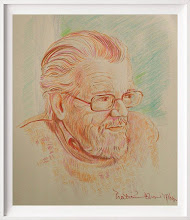
Uncle Stanley
Rest in Peace Uncle Stanley - Dr Stanley Crooks, 1925 to 2013. Solider in the Burma campaign, businessman, academic, and author.
Friday, 13 December 2013
Trying to get into the Festive Spirit
That time of year when, too mean to buy cards, I design my own; and have for the last couple of years designed a friend's as well. Most have been rat-themed - well what could be nicer or more apt? - but said friend discovered that Christmas cards bearing rats were introducing a slight chill into his relationship with friends, and wanted a reindeer - a "sad reindeer" - this year instead.
Well how the Hell do you draw a sad reindeer? It's not exactly appropriate - and I've had no end of trouble coming up with anything. Maybe I've got a design now, but one of those he took a look at and thought "perhaps not" is offered below.... I can see why he thought it just a little unlikely as a Christmas card - but it does reflect my mood rather nicely when asked to draw bloody reindeer....
 I did another as well - which was neither particularly sad nor particularly funny - but I took a shine to a photograph on Google, to whom I offer appropriate acknowledgement even though I've changed it a good deal; I don't know - maybe I'll use this one on my own cards; those that are fit to be seen by elderly relatives, anyway.... In my defence, I've never drawn a reindeer before, nor yet any other kind of deer; but it was quite fun.....
 I really needed more information than I had in order to draw the critter properly - preferably, a real live reindeer: but there are so few of those in Niton Undercliff.....
Well how the Hell do you draw a sad reindeer? It's not exactly appropriate - and I've had no end of trouble coming up with anything. Maybe I've got a design now, but one of those he took a look at and thought "perhaps not" is offered below.... I can see why he thought it just a little unlikely as a Christmas card - but it does reflect my mood rather nicely when asked to draw bloody reindeer....


Sunday, 8 December 2013
Skype, You're As Slow As Death ...
A friend of mine keeps in touch with me, or tries to, via Skype since it took over from Instant Messenger. It would be quicker if he sent smoke signals or used carrier pigeons. I've seen faster state funerals. Maybe, Skype, if you really can't do it, just give up?
Friday, 22 November 2013
Catch-up time...
There won't be a blog post for November if I don't pull my finger out soon, so - er, Hallo! I've had a bit of time off while my pain-killers (killers! Ha...!) were adjusted; and I see that my poor blogspot is free of advertising - suggesting that no one is reading it - and that I still have only 16 followers, one of whom has, sadly, passed away.
It's not encouraging, is it?
Still - I know that people DO visit, because they tend to comment elsewhere - eg, on Facebook. So I shall persist, in spite of indifference: I don't care if you don't care, so yah, boo...... Except I do, of course.
Anyway - while I've not been entirely inactive, it's been hard to take photos of recent paintings because they were on watercolour paper: too dark in the Batcave to get a decent shot, impossible to take a pic outside because the wind would have blown them away or the perishing rain would have destroyed them. I'll post a couple - BAD photographs, I fear, but then at least no one will be tempted to steal them, as they sometimes do (not you, gentle reader: just the odd rat-fink from China).
Now, how about buying an e-book on Oil Painting Basics for Christmas? Present it to your budding artists - you've heard this Spiel before, but it's always worth a punt. Oil Paint Basics, by Robert Phillip Jones, Amazon Kindle Store. Go on, you know you want to. You do. No, you do. Do.


I did SAY they were bad photos: I'll tickle 'em up a bit in a day or three. Both watercolours, on Bockingford. If you're interested in purchase and want a better scan, just email me or comment.
Wednesday, 30 October 2013
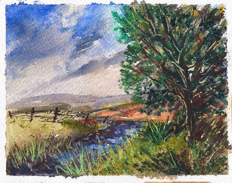
Downs at Niton, Isle of Wight
This is a 10" by 7" watercolour on The Langton NOT Grand Fin. Available unmounted and unframed at £40.00 plus post and packing.
And while we're being nakedly commercial, don't forget my E-book on Oil Painting Basics, available for a laughably modest price on Amazon's Kindle Store: Christmas present for the family's budding oil painter, perhaps?

And while we're being nakedly commercial, don't forget my E-book on Oil Painting Basics, available for a laughably modest price on Amazon's Kindle Store: Christmas present for the family's budding oil painter, perhaps?

Monday, 28 October 2013
I have been working, honest
Trouble is, it's a bit dark here in the Batcave, and I need to take paintings outside to photograph them; just a bit difficult, that, in this weather.
A small crop is offered below, anyway.


Quarter Imperial watercolour, on Bockingford Rough, of one of our upsy-down hills - the dark shapes beneath the trees might be cows; or bullocks.


A small crop is offered below, anyway.

A skew-whiff acrylic on watercolour paper. Seasonal, I thought.


Through the Gap - Watercolour of the Niton Landslip: this was once part of the lawn at Reeth Lodge.
Watercolour on Fabriano Rough, around 8" by 6", based on a drawing in my sketchbook, location - I've forgotten!

Watercolour on Fabriano Rough, 8" by 6" approx., Through the Branches to the Sea. This was painted just before the storms hit, but I anticipated them by bringing a tree down.
More will follow, when I can actually take a photograph of the bigger ones.
Friday, 4 October 2013
Back to Watercolour
I'm on something of a watercolour jag at the moment - working on my third this week, and will post pictures next time.
Watercolour paper comes in various weights, one of the most common being 140lbs, otherwise known as 300gsm. This gets confusing to someone like me, who struggles with figures and symbols. In short, this paper is one of the thinner ones (there are even thinner). This can be - and invariably is - a problem if you use a fair amount of water with the paint (which by definition, you do). The thinner papers cockle - they corrugate horribly when you're painting and only gradually lie back down as they dry. So if you're trying to paint a straight horizon line (note to all learner painters: horizons must be level - water doesn't flow uphill) it's the devil's own job to get it right: you can't really see it properly until the paper dries out and goes flat.
To counteract this problem - I wish I could say entirely defeat it, but that's something of a matter of chance - many people stretch their papers, soak them in water (and that really means SOAK) lay them down on a board, and stick them to the board with gum-strip. There are video demonstrations of this on YouTube.
Apologies to all who know this already.
When the paper has dried out, the idea is that the gummed paper will hold it in place as it shrinks, thus giving you a flat surface on which to paint which won't cockle. But it doesn't always work: the gummed paper lifts, or the paper wasn't wet enough so that all the fibres were saturated, and you still get cockles; but should get fewer of them.
Stretching paper, however you do it, is however a bit of a faff .... and as soon as I reach the last sheet of my present batch of paper, I'm going to buy some heavier weight paper (300lbs or so) which is more expensive, but doesn't cockle and doesn't need stretching. What I want to know is - WHY do so many artists' suppliers offer only the lighter weight papers? And why are they so conservative in the range of papers offered? There are many more than the standard Bockingford and The Langton (nothing wrong with those, mind). Arches, Fabriano Artistico, Saunders, Schoellershammer, Hahnemuehle, Two Rivers, and more. I can understand why art shops don't carry all the ranges available, but could the bigger companies who trade online not offer more ranges and weights, so that beginners don't get lumbered with the most difficult papers to paint on?
Tuesday, 17 September 2013
Computer Chaos
If anyone out there has sent me an email in the last 2 weeks, and not had a reply, or only a holding reply, please send it again because I've lost the lot, plus my email contacts - I knew there was something I'd forgotten when reinstalling Windows, and that was what it was - computers seemed like such a good idea at the time; I'm now finding the quill and parchment strangely attractive....
Wednesday, 11 September 2013
A Few Recent Additions


From the top - Into the Marsh, acrylic; then Dream House, oil sketch on paper; then Memory of River Thames holiday; and finally Dream House, Carbon pencil, conté crayon and acrylic black and white on cartridge paper.
Tuesday, 10 September 2013
The Old Tower
This was the main entrance to Reeth Lodge, until it was demolished as a dangerous structure - I live in the other half of the house, or part of it; this wing is the older part, which was unfortunately undermined by the landslip in ca. 1995. Since then, the land has been drained, and rock armour has been installed in Reeth Bay, so it's as safe as ..... a slice of steak in a dog's bowl...
The tower came down a few years ago: what's left is a hole, like a gap in a row of teeth. But don't talk to me about teeth. I said - don't talk to me about teeth!
.JPG)
Drawn in charcoal, A3 size.
The tower came down a few years ago: what's left is a hole, like a gap in a row of teeth. But don't talk to me about teeth. I said - don't talk to me about teeth!
.JPG)
Drawn in charcoal, A3 size.
Sunday, 1 September 2013
Friday, 30 August 2013
Pictures from an Exhibition
These were taken at our recent Vectis Artisans exhibition at the Presentation House Gallery in Ryde, IW. One shows a couple of my paintings, another shows paintings by Becky Samuelson, Tony Westmore, Murray Ince, and others; and the ceramic models are by Juliet Collins.
It has to be admitted that we did not do well at this Gallery, which is a new venture and unfortunately situated in a quiet part of town (other parts of which can be anything but) and has not yet made a name for itself as a venue. It is however a beautiful building, and I very much hope that in time it will become the premier venue it so deserves to be - a bit more work on publicity is required before that's likely to happen; but although it wasn't profitable for us, on the whole, it was a pleasure to spent time with other artists in the group, whom I'd not got to know well before, and to learn about their techniques and approach to painting.
We learn a bit more from each exhibition, and although these are hard times for anyone working in the visual arts, I hope we'll have more financial success next time.


Sorry, old age! I've forgotten who painted the picture on the far right in the second photo - pity, as I DO remember it received a lot of very favourable comments.... I had the name when I started this post, but it deserted me minutes later. Oh dear. I'd take a memory pill, if I could remember where I put them..........
Tuesday, 20 August 2013
Get Well Roger....
A get-well card to Roger Skidmore, who had the inestimable privilege to be my optician for some years, who has suffered a detached retina. As I've had the same operation, I fully sympathize: it takes a while to recover from this. I hope his surgeon was as good as mine.


Monday, 19 August 2013
Vectis Artisans Exhibition, August 23rd to 28th, Ryde, Isle of Wight
Vectis Artisans (Vectis being the Roman name for the Isle of Wight), a group of 11 island artists founded by Murray Ince, are holding only their second joint exhibition from Aug 23rd to 28th at the old Nunnery (Presentation House), 55 High Street, Ryde. Doors open between 11am and 4pm. Paintings, ceramic sculpture, photography - come and pay us a visit.
Tuesday, 30 July 2013
Oink!
Painted this Capitalist Pig for a birthday card for a friend of socialist leanings - well, I say leanings ... if he leaned any further he'd be out of the window. One Stephen Edward Moorcroft, to be precise, who has adopted C. Pig for his Facebook homepage. Or is it Steven .... could well be...
Am I getting old and forgetful? Well - yes, obviously.
Capitalist Pig is an oil painting on a cigar-box lid - I'm running out of cigar boxes, so this would be just a splendid opportunity for all my many admirers (hallo....? Are you there.....?) to send me more boxes; with cigars in them, naturally. Big 'uns, I like .... All right, I appreciate you may not run to Havanas, but the Nicaraguans do a very satisfactory range. Don't stint. No sense in spoiling the ship for a ha'port of tar, eh?
Wood - at least at this size, at which warping isn't much of a problem - is a very satisfactory surface for oil paint, once it's primed and sealed of course. It takes the paint well and allows detailed drawing, if you want it: canvas, at least the cotton duck variety which most of us use, isn't so forgiving or accommodating. I think I'd use wood all the time, if I could get a reliable supply - must investigate.

Friday, 12 July 2013
loose watercolors The Wesson way
Great video demonstration by Alan Owen, one of my favourite watercolourists who deserves a wider audience even though he's conquered YouTube, which is more than I've done!
Friday, 5 July 2013
Mick Saunders
Rest in peace Mick, also known to many of us as Bloodaxe (and well-named!), a talented pastellist and oil painter, a fellow devotee of lead white oil paint, and a watercolourist until a stroke robbed him of manual dexterity.
He'll be much missed on Painters Online - deepest sympathy from all of us to Marilyn Saunders and family.
He'll be much missed on Painters Online - deepest sympathy from all of us to Marilyn Saunders and family.
Thursday, 27 June 2013
Wide Blue Yonder
Posting this latest acrylic with Chromacolour, from a photograph by Bob Blake of an area I well know but find it difficult to get to these days..... 30cm by 40cm. And for sale (of course) - I must put it on the website, which sorely needs an update...
A fellow-artist was wondering the other day whether, in view of the expense, it's possible to go on painting in oil. Trouble is that if you get a bit better at it, you want better paint - and the better paint costs a lot more than the basic student grades, like Daler Rowney Georgian and Winsor and Newton's Winton. It IS a problem, but I'll never abandon oil unless it just becomes prohibitive.
Acrylic, fortunately, remains affordable and has its own advantages. I'm told that art buyers favour oil over acrylic, but if they do they're going to find the cost of work steadily climbing. Working on a small one at the moment - it'll take longer to finish than this acrylic did, because of drying times.

Monday, 10 June 2013
Nervously waiting .....
An exhibition looms with Vectis Artisans on Wednesday pm (set-up), from June 13th to 18th, at Quarr Abbey on the Isle of Wight, in which I'm supposed to be taking part.
Well, I WILL take part, one way or the other, but am awaiting framing pieces which, as yet, haven't arrived... They would have done, of course, if I'd ordered them earlier; or I could have got the pictures framed professionally - am just reluctant to provide any more than temporary frames, because I like buyers to choose their own frames: a minority view, probably, but then most of my views are minority views.
I'm not, for various reasons, quite ready or prepared for this exhibition - thanks solely to my failure to pay attention, I was planning towards another exhibition we're to hold in August, in Ryde town itself, and allowed this one to creep up on me.
Anyway, this photograph taken by my landlord, one Chris Hayes-Davis, shows me waiting anxiously at the gates.....

Friday, 7 June 2013
Surplus to My Requirements - But How About Yours?
I have in the region of 100 artists' magazines - mostly The Artist, Artists & Illustrators, and International Artist, presently taking up space which I don't really have to spare. They were useful in their time, but I've read them now and absorbed all I'm ever going to.
If you're an art student, tutor, interested artist, or a dentist with a waiting room, come to that, you're more than welcome to them. I don't want anything for them, but the downside is that unless you only want a few and live near enough to me for me to be able to get them to you, you'll have to collect them. They're in generally good condition, and date from between 2000 and 2011,
First come (if anybody does) first served.
Thursday, 23 May 2013
God, it's COLD
May 23rd, and it's so cold still I've had the heating on ......
Anyway: have found a new NHS dentist, just a few miles away from me (Mr Brian D Hamilton, BDS); had my teeth scaled and polished, and a new filling; and some 20 years of dental phobia have been put to flight, because there was no heavy drilling; there was just the one injection, which scarcely hurt at all because it was skilfully administered; and while I have to have further treatment, it has been scheduled at 3 monthly intervals throughout the year. So I don't have to lie there for half an hour at a time while major reconstruction work is conducted.
All to the good - and I've been lucky: because the only other dentist offered to me on the NHS was around 13 miles away, and difficult to get to from here (as most places are).
And in the meantime, the pocket watch I was given on my 21st birthday, some 41 years ago, has been repaired by the splendid Mr Burrage of Ryte Time Watch Repairs, and should arrive back here at the Batcave tomorrow. While pocket watches are not the splendid things they were before the wrist-watch was introduced, they still have a certain something which the wrist-watch (could I but bear to wear one) lacks: t'is true that I should like a Waltham, or an Elgin, or a Hamilton - encased in rolled gold. But these are beyond my means: as it is, I have some Russian watches, a German one, and a Swiss Jean Pierre - the youngest of which is around 10 years, the oldest nearer 50 - now, if you were all to go out (don't delay, do it now) and buy a pocket watch, imagine the surge in popularity they would enjoy. Off you go, then.
Oh, and if anyone would like to give me a Waltham, or Elgin, or Hamilton (or Pathek Phillipe; or Tissot) don't hesitate! I must have a birthday coming up sooner or later. So much better with a nice chain, by the way - rolled gold, perhaps; or rose gold ..... Don't stint. Just not a wristwatch - I hate things that lurk about my wrists as much as I despise ankle-socks; socks must be LONG: knee length; gents underwear must eschew anything hinting of the boxer, or short (one has to think of support, you see, and unsightly bulges - so that you DON'T see), and trousers should ideally fit way above the hip bone (which is just hideously uncomfortable, especially if the hips are beginning to give trouble) in the region of what was once the natural waist: somewhere just below the nipples, for preference.
Young men may ignore all this: but believe me, lissom youth - your time will come: comfort will one day be your watch-word. And, if you do not repulse the loathsomely trendy tailor and reject the "slim-fit" suit or shirt, if you do not demand a cut which ensures that there is not a ridiculous flash of shirt between the bottom of your waistcoat the the band of your trousers NOW, you will find that, when you come to the age of seniority and experience and require these things, there will be no one capable of making them. Oh, and put a TIE on, for God's sake.
One just loathes a sloven. Aged watch shown below.
.JPG)

Friday, 10 May 2013
Eye Off Ball.....
I took a look through my old entries today, in order to find something, and discovered a number of comments I wasn't aware had been made - so will have to check back more often. Apologies that I didn't reply, where replies might have been advisable - there must be a way of receiving notification from Blogger that comments have been made, but I don't at the moment know what it is.
Similarly, I have no idea what happened to the formatting of the last post, where a gap appears in the last paragraph for no obvious reason. Can't edit it out, no matter how I try.
One of the comments referred to a piece on Bob Ross - and argued that Ross used painting as therapy, and that many of his students then and now do the same; and that it's not reasonable to judge his or their paintings as, eg, landscape painting. I've summarized the argument a bit without I hope misrepresenting it.
This is true so far as it goes - and you might also argue that when seeking tuition, you tend to find that which suits the level you wish to reach: so that the student who wants to go on, and delve into the minutiae of technique, colour-mixing and all the rest of it, is not likely to be lingering over, say, Bob Ross, Bill Alexander, or Darryl Crow for long; he/she will leave them behind as not being enough - will go elsewhere because the Bob Ross approach is for hobbyists rather than serious painters (words a problem here: I have nothing against "hobbyists", and don't always go all slack-jawed in amazement at the "serious painter", either).
I don't think the argument is too sustainable though if you look at what is now the Bob Ross Corporation (TM), its protection of the brand image - eg, by taking anything down from YouTube which shows more that a few minutes worth of Ross's work - or if you look at the mass of equipment available in the BR (and Bill Alexander) method. It's a big business, and the various "certified Bob Ross instructors" ARE selling what they call painting tuition. I don't see how the person starting out in oil painting is necessarily going to know that the methods are not at all easily transferable to more straightforward, or traditional, or ultimately far more enjoyable and productive methods. What I object to is primarily the extreme expense the BR approach entails - I don't think it's fair to those starting out; and I would still warn them that there are better ways: indeed, I think almost any other way is better.
However, I had an email correspondence a while ago with a Bob Ross instructor named Jason Bowen, who has some work on YouTube: he seems to be a genuine young man, and also made the point that he's not trying to be the next Rembrandt or Van Gogh; he knows his painting is a hobby, and he's trying to give people a sense of achievement - something they've made with their own hands and can take pride in. I accept that - while reserving the view that even for those who don't have ambitions to stride a bit farther, there are still far more satisfying ways of doing what they want to do.
But there we are. Thanks for the posts, and I don't at all object if they disagree with mine - so keep 'em coming.
Thursday, 2 May 2013
Signs of Spring
I think I've nearly finished this painting - one or two small details to add, but I don't think I need to do (or can do) anything very major with it. It was surprisingly difficult - you'd think what's the problem? A big lump of distant rock, a nearer lump of rock, a few tree-tops, a bit of sky - but I got too tight and literal, and to break free of myself I included a promontory that isn't really there and allowed the rock textures to look a bit warmer than they really do - because it kept turning into Gormenghast otherwise! A grim fortress-like appearance.
One day, I might do the grim version; probably not in acrylic though, which this is. 30cm by 40cm, on canvas covered board. It's an impression of Gore Cliff and Blackgang Chine: there's a holiday-cum-pleasure park at the foot of the cliffs, but you hardly know that at all from the cliff walk, unless you get much nearer to the edge than I ever want to do.

One day, I might do the grim version; probably not in acrylic though, which this is. 30cm by 40cm, on canvas covered board. It's an impression of Gore Cliff and Blackgang Chine: there's a holiday-cum-pleasure park at the foot of the cliffs, but you hardly know that at all from the cliff walk, unless you get much nearer to the edge than I ever want to do.

Friday, 26 April 2013
First stage - new Acrylic painting: Cliffs, South East Wight
Yielding to advice, I've decided not to muck about with the Hoy Monument oil any further - you can go on refining a painting for months, even years: but on the whole, I said what I wanted to say, and any more would be waffle.
So, I've started a new one - only this time, it's an acrylic: this is the first stage of it, and it looks pretty ghastly at the moment; but I'm confident it WILL look much better in due course. Strange how the photograph shows bits of the underpainting showing through in the sky area which actually aren't visible to the naked eye: the flash has exposed them - so probably they would be visible under certain lighting conditions if I left the sky as it is. But there are several glazes of colour to go on top yet - so far, it's had Burnt Sienna, Zinc White and Raw Sienna, and Ultramarine (not a blue I normally use) for the sky. A layer or two to go on yet - but the idea is not to finish one area of the painting independently of the others, but to work on the whole picture and - as it were - bring it up together.
I need to get a few new paintings finished because Vectis Artisans, a new group of Isle of Wight artists which I've joined, has an exhibition in a month or so - I want to show some work that's not been seen before, and the quickest way of doing it is going to be to use acrylics: they dry much quicker, and can be varnished a week or so after completion. To varnish an oil painting earlier than 6 months after completion is to risk it cracking.
This one is also based on a photograph by Bob Blake - so one way or another, I have enough photographs and sketches to keep me going until I'm around 90 .... in theory. In practice, I'm always on the look-out for more. Hope he reads this hint....

Thursday, 25 April 2013
Hoy Monument
This is a much more direct painting than the last one - I didn't build it up on a monochrome base, but got my colours in early, then glazed different blues and violets over the sky and background, and a little over the middle-ground. Used Titanium and Zinc White, and not much of the latter - they worked: Daler Rowney Georgian Titanium White is actually rather pleasant to work with; but I think my favourite Flake White would have been a little easier. Still - was life meant to be easy?
Obviously not, going by my experience of it.
This is 30cm by 40cm, and although I know the area well, it's from a photograph (freely adapted) by Bob Blake.
I may yet do some more glazing, in the foreground at least .... just to calm down some discordant bits which have become (I think) over-prominent.

Thursday, 11 April 2013
All Stages Together


Well there we are; some major changes along the way, although the basic composition has remained constant - for better or worse. This one is 30 by 40cm - we move on.... Our myopic eyes fixed on the far horizon....... The title by the way is Whan that Aprille with his shoures sote .... not sure this was what Chaucer had in mind at the time.
Next stages
True to my word, and in the face of massive indifference, I post the next couple of stages of my oil painting of cliffs on the Isle of Wight - an immediately obvious problem arose when I glazed blues over the skies, and one I should have anticipated: I hadn't left the area light enough, and far from glazing I would have to add opaque colour to lighten it. An elementary mistake, which I really ought not be making after all these years, but then - the purpose of this heroic enterprise is to offer suggestions to others as to what they might - and might NOT - do themselves.
It became increasingly clear therefore that while I could transparently glaze over the foreground areas to my heart's content, I was going to need more opaque white in the sky and sea than I'd planned on. Because my planning had been inadequate, and I haven't used the glazing technique on a larger scale at least for quite a while. But never mind: the combination of approaches will work out, in its way, in the end. It'll all come out in the wash - I expect.....


It became increasingly clear therefore that while I could transparently glaze over the foreground areas to my heart's content, I was going to need more opaque white in the sky and sea than I'd planned on. Because my planning had been inadequate, and I haven't used the glazing technique on a larger scale at least for quite a while. But never mind: the combination of approaches will work out, in its way, in the end. It'll all come out in the wash - I expect.....


Thursday, 4 April 2013
Foot in Mouth Disease
I've done it again. Made a comment on a poor, defenceless artist's work on Painters Online, said more than I should have done, caused offence. Mind you, it's the easiest thing in the world to offend some artists - I tend to make the mistake of forgetting just how thin-skinned most of us actually are, having not so much confidence in our abilities as we like to pretend.
This time, there was a double-edge to it; it was a portrait of Kate Middleton, the Duchess of Somewhere or other I can never remember (because, of course, I don't care - and there lies part of the trouble).
I didn't actually say why on earth are you painting a portrait - from a photograph - of Ms Middleton, when a professional portraitist who had her actually sit for him made, by most accounts, something of a ghastly mess of it. But looking back on what I did say, I think I probably hinted at it pretty heavily - with my usual tact. I.e., none to speak of.
Poor Defenceless Artist noticed this innuendo, anyway, and told me how caring and compassionate Ms M is, just like Princess Di .... well. If you say so. She also says that Ms M is "beautiful". And again - it's in the eye of the beholder - although: let's be honest .... she isn't. She's just young; reasonably attractive; has no personality that has as yet come across to anyone outside her immediate circle - and why should one expect it to have done so at this stage? - and presents any portraitist with a big problem: her personality is not yet written in her face; and she seems to have a beezer of quite impressive proportions, anchored in something of an expanse of pale flesh.
Or so you would believe from the official portrait - I've heard of those in which the eyes follow you round the room; rarely seen one in which the nose does the same ....
I've not seen the official portrait in the flesh, and the news photographs of it, both physically in the actual newspapers and online, have varied so much in tone and clarity that I hesitate to agree or disagree with the consensus that has unfortunately formed around it. And anyway, I'm no authority on portraits. But I do know that anyone who tries to paint a portrait from a photograph alone is on to a sure-fire loser: it CAN be done - if you have a really superb, and preferably monochrome, photograph (such as might be taken by my friend Barry Fitzgerald, professional photographer based in Tralee) but the result, in anyone other than a very good professional's hands - better than most of us by a league or two - is very likely to be stonkingly poor. That's because you can't see things, features, move - you can't see how they work together; this is particularly so around the mouth, especially when you're trying to capture a smile; you can see the set of the head in the photograph - but not in reality.
So Poor Defenceless Artist was right, really: I was taking out on her, a bit, the facts that a) I haven't a lot of time for the syrupy sentiment poured over the royal family, and lack respect for the majority of them; b) I don't want to see any more portraits of Ms Middleton or any other fairytale princess de nos jours; c) I think amateur portraits from photographs look so ghastly on the whole that they're an embarrassment on a website, despite the skill the individual artist may possess - and I suppose, digging deeper into my motivation than even Sigmund Freud would have done, I'm basically saying I don't like this, don't want it here, don't do it.
Which of course I have absolutely no right to do. Although I still hate it when people dabble in celebrity portraits and try to impose their own hero-worship on their subjects: because it always means the art is compromised at best, and just downright bad at worst.
It just might be better, though, if I learned to bite my tongue and get on with my own work rather than either condemning someone else's or damning it with faint praise. Wonder if I ever will......
Tuesday, 2 April 2013
Work in Progress
Here's one way to start a painting.
You could do this in oil or acrylic. In this particular case, it's an oil. And I'm using a quick-drying white - you could use Alkyd White; or Underpainting White; but this time, I'm using the remains of my lead-based Flake White, which is becoming harder and harder to lay hands on - partly thanks to European Health and Safety Regulations, but mostly because the last major manufacturers of lead chromate have shut down. So if it's going to be available in the future, it's going to be expensive - the remaining manufacturers will of course put their prices up.
Anyhow - I've got some, so I'm using it!
First, I've stained the canvas board with Burnt Sienna, diluted with Low Odour Thinners (could just as easily have been Turpentine). Then, I've drawn a basic design with a mix of Burnt Sienna and Ultramarine Blue; and then I've worked into that with the Flake White, the idea being to allow these lights to shine through paint applied on top of them - in other words, this is a means of achieving the "glazing" method in oil paint.
Over the next few days or weeks - emergency dental appointments permitting: don't ask - I shall glaze transparent colours over the top of this underpainting, which has now dried; I'll probably need several layers, increasing the amount of oil very gradually in each so I can avoid any risk of the paint cracking later. And - hugely bravely, you might think: I certainly do - I'll show the stages here and elsewhere, in the fond hope it'll all work out on the night. I may need some luck with this....


Thursday, 14 March 2013
Biting the Tongue
I've made two comments this evening on the Painters Online blogs, and have then scrubbed both of them, on the grounds that there's no point being wilfully offensive. Actually, there's probably a LOT of point being wilfully offensive, but I know POL: posting provocative views just upsets people for no great gain. So I've censored myself.
But here, I can let rip .... one blogger tells us how inspired she is by the Zen practice (or practitioner?) of Wabi Sabi; she's flogging something, or trying to; another goes to town with a screed of psychobabble about meditation, unleashing the hidden power of creativity (this on a site for artists, who, you may feel, have already got into touch with their creative impulses): and she's flogging something too, specifically her holidays in Spain where, for a modest raid on your wallet, she will teach you - armed, as she is, with a polytechnic degree and a teaching certificate - how to relax; although the whole exercise seems calculated to cause her bank manager to slip into blissful contentment rather than anyone else: apart from herself.
You can base your painting practice on any damn' thing you like: it rarely makes the least difference; we have religious painters, painters who are simply inspired by religion, metaphysical painters, painters inspired by, for all I know, a Plumbing Manual. What gives you the first push varies from person to person, and has very little relevance or importance. If you want to wallow in this New Age pile of old socks, you do it.
But it's just a little odd how often those who talk the most vacuous old toss are nearly always insinuating a clutching paw into your pocket at the same time, isn't it?
Painters Online is a site for artists and would-be artists; not a forum for spurious life-coaches flogging continental holidays with a bit of woo thrown in. But if I said that on POL, I should be a horrid, grumpy old man. Well, I AM a horrid, grumpy old man: and this sort of festering cobblers makes me even grumpier. Why do people fall for it ......?
I post below a couple of the very small oil paintings I did in February - 7" by 5", on stretched box canvas, offers in excess of £50 each cheerfully considered. You see, I'm after your money too. But at least I don't dress it up in mother's crumpled old corsets pretending they're a silk gown......


The Utter Silence
Nothing from me since the end of January - appalling. Why, I ask myself, have I been so uncharacteristically reticent? Well obviously, sheer idleness explains much of it. Why blog, or indeed do anything else, if you can stay in bed? It defies all reason....
But there have been other issues too. The light has been awful - useless for painting. I've been cold - well, all right, so have you, but unclenching those little fingers and handling chilly art materials - paint, water, oil - in this freezing little hovel I call home just hasn't appealed.
After a while, though, said fingers begin to itch. Stray towards brush or pen or pencil .... and even laziness is put to flight.
Just to add to my litany of excuses, though, I've had one or two health problems - principally around the teeth; infected sinuses; lots of antibiotic; and I've got to have a full blood test - phials of the stuff - just over a year after I had my haemorrhage: to see all the blood they put into me has mixed happily with the sludge that was already there, I suppose.
Well go and do it, you say. Get it all seen to. Ha! Easy for you, I reply - but I've got to get to the hospital, and fast - ie, not eat for 12 hours (how ghastly!), and then the dentist is miles away as well, and I don't drive...... I mean, I do prevaricate: I admit it. I even put off putting things off. But it's not easy, you know; when one's rich in years but nothing else; has no transport; services miles away....
Granted, this is 95% self-pity. Say 97%..... but it does strike me that when people speak so blithely about the efficiencies of centralization of health services, "centres of excellence", and so on, they do overlook the desire of your average patient to be treated near to home. If you have cancer, you're going to be very likely to be treated at centralized locations, and given that's where the best treatment is that's probably where you're going to want to go. But we hear on the Patients Council at St Mary's Hospital of people who are given ridiculously early appointments in the morning which, given our inadequate transport links, they've no hope of getting to.
I have many reasons to be grateful to the NHS, but now and then you get the impression that some of those who manage it have cottage-cheese for brains - and fail to take into account the sheer physical difficulty of moving object A, the patient, to location B, the clinic. Strange how none of the reforms introduced by Lansley and the little Hunt who's taken over from him seem to make the slightest difference to the convenience of the patient, though.

Saturday, 26 January 2013
Book on Kindle Store, Amazon
http://www.amazon.com/dp/B00B5JYU7O
People have had some trouble finding this,but it should be there now, fingers crossed.
People have had some trouble finding this,but it should be there now, fingers crossed.
Friday, 25 January 2013
The Last of the Titchy-Pics....
Months ago, I bought a job lot of 10 7" x 5" block canvases. I only really needed one of them, but as it happened they were on offer....
So having painted the one which I'd been commissioned (as it were; brother's birthday present, in fact) to do, I then had another 9 canvases to paint; and whether my eyesight's got worse, or whether it just wasn't a great idea to start with, I don't know: but it's been a bit of a struggle just to see the blessed things.
Anyway! I've painted the very last one - you can see all three of the last tranche on my Facebook page, but for those of you who wouldn't go on Facebook if paid in gold bars, here's one of them.
 It's a rather summery painting for this time of year, but it's so grey and dreary outside that I wanted something with a bit more colour.
And - Stop Press - my e-book, now titled Oil Paint Basics, has now been made available for the Kindle, and is available from Amazon UK. I also have some work on show in a new café in Upper High Street, Ryde IW: unfortunately - I don't know the name of the café... Ryde isn't the easiest place to get to from here. But there can't be that many up there, so should you be in the vicinity, take your cheque book for a nice walk, cup of tea, slice of cake, and a painting to take home. You know you want to. You do. No, really - you do.
So having painted the one which I'd been commissioned (as it were; brother's birthday present, in fact) to do, I then had another 9 canvases to paint; and whether my eyesight's got worse, or whether it just wasn't a great idea to start with, I don't know: but it's been a bit of a struggle just to see the blessed things.
Anyway! I've painted the very last one - you can see all three of the last tranche on my Facebook page, but for those of you who wouldn't go on Facebook if paid in gold bars, here's one of them.

And - Stop Press - my e-book, now titled Oil Paint Basics, has now been made available for the Kindle, and is available from Amazon UK. I also have some work on show in a new café in Upper High Street, Ryde IW: unfortunately - I don't know the name of the café... Ryde isn't the easiest place to get to from here. But there can't be that many up there, so should you be in the vicinity, take your cheque book for a nice walk, cup of tea, slice of cake, and a painting to take home. You know you want to. You do. No, really - you do.
Thursday, 17 January 2013
Flooded Fields
I was given a tube of Aureolin watercolour made for the SAA (Society for All Artists) the other day, and it cleared up a longstanding mystery. I have wondered quite why demonstrators of watercolour techniques on the Painting and Drawing Channel (www.thepaintinganddrawingchannel.co.uk) use paints that (like Aureolin, Rose Madder, Alizarin Crimson and several others) are "fugitive", ie not lightfast.
The reason would seem to be that while these SAA paints carry the old names, they aren't the same pigments at all. Makes you wonder why some manufacturers stick to these old labels when anyone who knows the first thing about paint durability wouldn't trust them not to fade or darken over a few months. It must surely confuse painters - there's a website called Handprint.com which is full of information about paint characteristics if it's of interest.
Anyway - responding to a challenge to produce a painting in 30 minutes, I did this one - the actual painting took a bit less than 30 minutes, but you can add another 30 to that to allow for the drying time. It has its points; I'd have preferred to take a bit longer, and iron some of the odder shapes out. Used Prussian Blue, Yellow Ochre, Venetian Red, Winsor Red, Cobalt Blue - and a touch of that Aureolin.

Monday, 14 January 2013

The cover of my E-book, available (in PDF) on DVD for £10 including postage and packing, or £8 for a download. Email me at robertjones@ratville.freeserve.co.uk for your copy. As advertised on Facebook - and indeed anywhere else I can think of....
This is the second and improved version - although those who have bought the first won't find it so spectacularly different that it would be worth shelling out again for it! If existing customers really want it though - and who am I to say thee nay? - I will happily send a copy of the second edition for free by download, or the dvd for £3.00 to cover my post and packing.
The cover painting is of Summer Fields at Arreton, Isle of Wight - 10" by 10", for sale unframed at £80.00.
Thursday, 10 January 2013
Painting again!
All sorts of things have cropped up to delay me this year, but rather than moan about them as is probably my wont, I shall just post my recently completed acrylic, which can also be viewed in all its multi-coloured splendour on www.painters-online.co.uk, and on my Facebook page.
For this one, I used a canvas-covered board by Pieraccini (www.pieraccine.com) supplied by Jacksons' Arts, and used Cryla Acrylic from Daler-Rowney, a bit of Winsor & Newton Artists' Acrylic, and Chromacolour (www.chromacolour.co.uk) for touches of glazing and detail. I'm particularly fond of their Naples Yellow - mixes with greens and blues to make a range of different greens: it doesn't behave anything like oil Naples Yellow, but it's a very useful colour in its own right.
Still looking for help with running my website: I've got a bit phobic about it - what I need is a young person to whom these things seem to be second nature. I shall feel a fool, of course, taking direction from a stripling, but I'd rather feel a fool than continue to be incapable of updating my own site.
So if anyone is out there .... you know where to find me.
Anyway, this painting is provisionally entitled Path to the Marsh, and is 30 by 40cm in size; it's for sale, as all my stuff is; and I have to confess I've forgotten where it was that I made the sketch for it - not that this should really matter very much, because all of my paintings are fairly freely adapted from the scene in front of me anyway. I know it's either Newtown Creek on the Isle of Wight, or a walk near Emsworth in Sussex ... must get into the habit of dating and placing my sketches.....
Painted on a red-coloured base, I used Titanium and Chroma White, Cobalt Blue, Raw Sienna, Yellow Ochre, Burnt Sienna, Prussian Blue, Naples Yellow, Cadmium Yellow Light, and a touch of Burnt Umber. That's my version of a limited palette in acrylic: normally, I use more colours in acrylic than in oil, and more in oil than I use in watercolour.

Tuesday, 1 January 2013
New Followers
Welcome to you - please make comments, add your own thoughts: it gets lonely out here - and I don't remove comments unless they're stupidly rude: a bit of honest criticism never comes amiss.
Those fresh from Comment is Free (chortle, gasp, snigger) on the Guardian will know what I think of as rude. Insult my opinions as much as you like: but don't insult me unless you know me well enough to do so.
And if you do know me well enough to do so - what kind of friend are you anyway, you git?
Those fresh from Comment is Free (chortle, gasp, snigger) on the Guardian will know what I think of as rude. Insult my opinions as much as you like: but don't insult me unless you know me well enough to do so.
And if you do know me well enough to do so - what kind of friend are you anyway, you git?
Latest on Painters Online
http://www.painters-online.co.uk/Blogs/New-Start/Confessions/_bl284_po2795_pg1
Hope you can find this - at times, blogger baffles me. At times? This is the man who can't even manage his own website...... help urgently required to sort it out for me.....
Anyway; look, here; consider; reflect - the purpose of this blog was really to determine if there's a market for lead white oil paint. There ought to be, if people are really interested in genuine oil painting rather than the miserable substitutes for same offered to leisure painters and hobbyists.
If you're interested in getting your hands on genuine lead white oil paint - Flake, Cremnitz, and Foundation White - please get in touch with me: here or on Facebook. Then we might be able to secure a reliable supply, and paint in oil to its fullest degree of possibility and achievement.
By the way - my e-book Oil Painting Basics is still available at £8 per download, £10 on dvd. Email me at
robertjones@ratville.freeserve.co.uk OR
jones-ratville@hotmail.co,uk
If you want to pay for it via my website, go to www.isleofwightlandscapes.net, but, especially if you want the dvd, don't neglect to email me with your address.
Oh, and Happy New Year!
Robert Phillip Jones
(www.wightpaint.blogspot.co.uk)
Subscribe to:
Posts (Atom)