Friday 26 April 2013

First stage - new Acrylic painting: Cliffs, South East Wight

Yielding to advice, I've decided not to muck about with the Hoy Monument oil any further - you can go on refining a painting for months, even years: but on the whole, I said what I wanted to say, and any more would be waffle.

So, I've started a new one - only this time, it's an acrylic: this is the first stage of it, and it looks pretty ghastly at the moment; but I'm confident it WILL look much better in due course.  Strange how the photograph shows bits of the underpainting showing through in the sky area which actually aren't visible to the naked eye: the flash has exposed them - so probably they would be visible under certain lighting conditions if I left the sky as it is.  But there are several glazes of colour to go on top yet - so far, it's had Burnt Sienna, Zinc White and Raw Sienna, and Ultramarine (not a blue I normally use) for the sky.  A layer or two to go on yet - but the idea is not to finish one area of the painting independently of the others, but to work on the whole picture and - as it were - bring it up together.  

I need to get a few new paintings finished because Vectis Artisans, a new group of Isle of Wight artists which I've joined,  has an exhibition in a month or so - I want to show some work that's not been seen before, and the quickest way of doing it is going to be to use acrylics: they dry much quicker, and can be varnished a week or so after completion.   To varnish an oil painting earlier than 6 months after completion is to risk it cracking.  

This one is also based on a photograph by Bob Blake - so one way or another, I have enough photographs and sketches to keep me going until I'm around 90 .... in theory.  In practice, I'm always on the look-out for more.   Hope he reads this hint....


Thursday 25 April 2013

Hoy Monument

This is a much more direct painting than the last one - I didn't build it up on a monochrome base, but got my colours in early, then glazed different blues and violets over the sky and background, and a little over the middle-ground.  Used Titanium and Zinc White, and not much of the latter - they worked: Daler Rowney Georgian Titanium White is actually rather pleasant to work with; but I think my favourite Flake White would have been a little easier.  Still - was life meant to be easy?

Obviously not, going by my experience of it.

This is 30cm by 40cm, and although I know the area well, it's from a photograph (freely adapted) by Bob Blake.

I may yet do some more glazing, in the foreground at least .... just to calm down some discordant bits which have become (I think) over-prominent.

Thursday 11 April 2013

All Stages Together


Well there we are; some major changes along the way, although the basic composition has remained constant - for better or worse.  This one is 30 by 40cm  - we move on.... Our myopic eyes fixed on the far horizon.......  The title by the way is Whan that Aprille with his shoures sote .... not sure this was what Chaucer had in mind at the time.  

Next stages

True to my word, and in the face of massive indifference, I post the next couple of stages of my oil painting of cliffs on the Isle of Wight - an immediately obvious problem arose when I glazed blues over the skies, and one I should have anticipated: I hadn't left the area light enough, and far from glazing I would have to add opaque colour to lighten it.  An elementary mistake, which I really ought not be making after all these years, but then - the purpose of this heroic enterprise is to offer suggestions to others as to what they might - and might NOT - do themselves.  

It became increasingly clear therefore that while I could transparently glaze over the foreground areas to my heart's content, I was going to need  more opaque white in the sky and sea than I'd planned on.   Because my planning had been inadequate, and I haven't used the glazing technique on a larger scale at least for quite a while.  But never mind: the combination of approaches will work out, in its way, in the end.  It'll all come out in the wash - I expect..... 


Thursday 4 April 2013

Foot in Mouth Disease

I've done it again.  Made a comment on a poor, defenceless artist's work on Painters Online, said more than I should have done, caused offence.  Mind you, it's the easiest thing in the world to offend some artists - I tend to make the mistake of forgetting just how thin-skinned most of us actually are, having not so much confidence in our abilities as we like to pretend.

This time, there was a double-edge to it; it was a portrait of Kate Middleton, the Duchess of Somewhere or other I can never remember (because, of course, I don't care - and there lies part of the trouble).

I didn't actually say why on earth are you painting a portrait - from a photograph - of Ms Middleton, when a professional portraitist who had her actually sit for him made, by most accounts, something of a ghastly mess of it.  But looking back on what I did say, I think I probably hinted at it pretty heavily - with my usual tact.  I.e., none to speak of.

Poor Defenceless Artist noticed this innuendo, anyway, and told me how caring and compassionate Ms M is, just like Princess Di .... well.  If you say so.  She also says that Ms M is "beautiful".  And again - it's in the eye of the beholder - although: let's be honest .... she isn't.  She's just young; reasonably attractive; has no personality that has as yet come across to anyone outside her immediate circle - and why should one expect it to have done so at this stage? - and presents any portraitist with a big problem: her personality is not yet written in her face; and she seems to have a beezer of quite impressive proportions, anchored in something of an expanse of pale flesh.

Or so you would believe from the official portrait - I've heard of those in which the eyes follow you round the room; rarely seen one in which the nose does the same ....

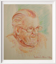
I've not seen the official portrait in the flesh, and the news photographs of it, both physically in the actual newspapers and online, have varied so much in tone and clarity that I hesitate to agree or disagree with the consensus that has unfortunately formed around it.  And anyway, I'm no authority on portraits.  But I do know that anyone who tries to paint a portrait from a photograph alone is on to a sure-fire loser: it CAN be done - if you have a really superb, and preferably monochrome, photograph (such as might be taken by my friend Barry Fitzgerald, professional photographer based in Tralee) but the result, in anyone other than a very good professional's hands - better than most of us by a league or two - is very likely to be stonkingly poor.   That's because you can't see things, features, move - you can't see how they work together; this is particularly so around the mouth, especially when you're trying to capture a smile; you can see the set of the head in the photograph - but not in reality.

So Poor Defenceless Artist was right, really: I was taking out on her, a bit, the facts that a) I haven't a lot of time for the syrupy sentiment poured over the royal family, and lack respect for the majority of them; b) I don't want to see any more portraits of Ms Middleton or any other fairytale princess de nos jours; c) I think amateur portraits from photographs look so ghastly on the whole that they're an embarrassment on a website, despite the skill the individual artist may possess - and I suppose, digging deeper into my motivation than even Sigmund Freud would have done, I'm basically saying I don't like this, don't want it here, don't do it.

Which of course I have absolutely no right to do.  Although I still hate it when people dabble in celebrity portraits and try to impose their own hero-worship on their subjects: because it always means the art is compromised at best, and just downright bad at worst.

It just might be better, though, if I learned to bite my tongue and get on with my own work rather than either condemning someone else's or damning it with faint praise.  Wonder if I ever will......

Tuesday 2 April 2013

Work in Progress

Here's one way to start a painting.

You could do this in oil or acrylic.  In this particular case, it's an oil.  And I'm using a quick-drying white - you could use Alkyd White; or Underpainting White; but this time, I'm using the remains of my lead-based Flake White, which is becoming harder and harder to lay hands on - partly thanks to European Health and Safety Regulations, but mostly because the last major manufacturers of lead chromate have shut down.  So if it's going to be available in the future, it's going to be expensive - the remaining manufacturers will of course put their prices up.

Anyhow - I've got some, so I'm using it!

First, I've stained the canvas board with Burnt Sienna, diluted with Low Odour Thinners (could just as easily have been Turpentine).  Then, I've drawn a basic design with a mix of Burnt Sienna and Ultramarine Blue; and then I've worked into that with the Flake White, the idea being to allow these lights to shine through paint applied on top of them - in other words, this is a means of achieving the "glazing" method in oil paint.

Over the next few days or weeks - emergency dental appointments permitting: don't ask - I shall glaze transparent colours over the top of this underpainting, which has now dried; I'll probably need several layers, increasing the amount of oil very gradually in each so I can avoid any risk of the paint cracking later.  And - hugely bravely, you might think: I certainly do - I'll show the stages here and elsewhere, in the fond hope it'll all work out on the night.  I may need some luck with this....