Wednesday, 13 April 2011

A major re-think


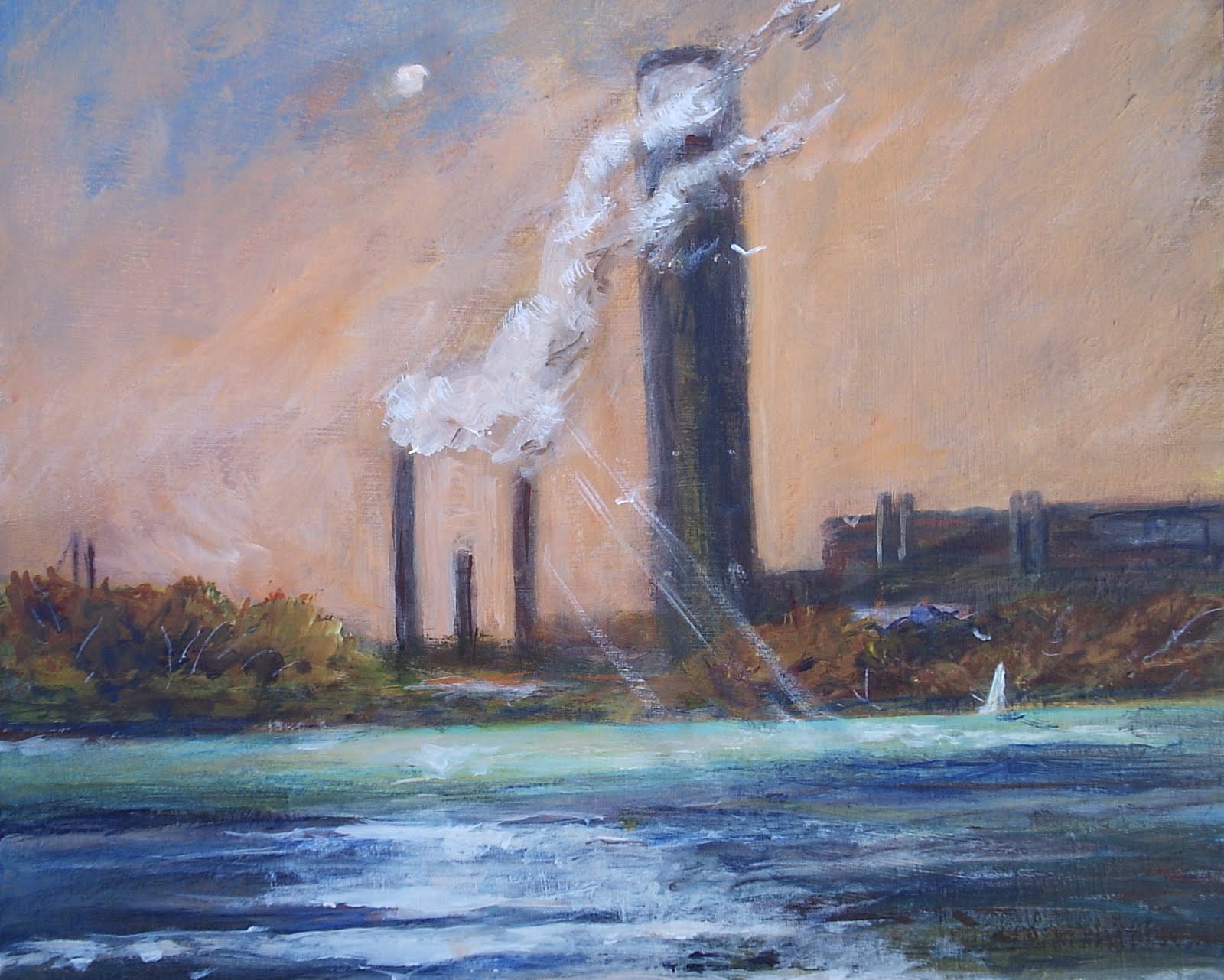
Every now and then, a plateau is reached, in whatever field of activity in which one is engaged; looking back on the last posting here, I felt - that's just not very good. It's boring; the earlier stages were better than the later ones. It's been fiddled with, and zhooshed up with colour, but actually, let's be honest: that hasn't improved it.
Over the last couple of weeks, I've tried to add to it, but the basic problem is that it's a dull subject, dully executed. I do not seek contradiction - spare me the "oh no, really, it's LOVELY!" - oh; you were going to spare me... Well, you were right. A few days ago, I added a yacht to the foreground; now, they say don't paint boats unless you really know how they work (which I don't). Others disagree, but I must say - I think they were right. So I feel a great big brush of white gesso coming on, to obliterate this image, and the creation of something different (and, one hopes, better!) on the liberated canvas-board.
I can make several excuses: I haven't really got on with this MDF covered with a rather fine weave of canvas; I prefer a lot more texture - and preferably, stretched canvas. Actually, that isn't several excuses; that's only one... maybe the best I can do. I just think the idea behind the painting wasn't up to snuff, basically - Fawley oil refinery could, I think, be translated into a decent painting in oil, and on a much larger scale than this - but in acrylic, on a painting 30cm by 30cm, it was maybe never going to work. In any event, I don't think it has.
Is this a bad thing? Well, no - we all produce the odd dog's breakfast; some of us show them, some of us don't; you learn from all of them, the successes and the failures, and maybe more from the latter than from the former.
In this case, it's stopped me for a while, and made me think about where I'm going - so await the next thrilling instalment while I ponder the next step.

Friday, 28 January 2011

Nearly finished


Here is the more or less completed painting (of Fawley Oil Refinery, from the Solent). I think it's a little skewed - had trouble taking the photograph, and it looks as though the chimneys are leaning slightly leftwards; this is complicated by a rather interesting (I lead a dull life..) optical illusion: the faint beams of light give the impression of an even greater lean, in the photograph, which isn't in fact apparent in the painting.
Anyway - it would have been quicker to say I'm a rubbish photographer, I suppose...
As you can see, this is a combination of glazing in transparent colour over the original underpainting, plus some thicker, opaque paint in places. Once upon a time, most paintings were created this way (in oil; this of course is acrylic); then alla prima came in, where painters tried to create an instant impression by laying down solid blocks of colour. The latter approach tends to lead to a somewhat looser effect; its drawback is a loss of luminosity.
This isn't completely finished yet, just one or two touches to add - but they'll be more obvious to me than anyone else, so - this is about it. Not on my website yet, but there are one or two changes there (www.isleofwightlandscapes.net) on the Buy page.

Saturday, 22 January 2011

Underpainting


Happy New Year, all... I've been very lazy over Christmas/New Year, but have been (by my standards) hyperactive in the new year. I decided to try another attempt at acrylic underpainting, glazing colour on top. This is the underpainting, I'll post the finished painting in a day or two - what I've done here is to do the painting in very basic colours, in this case burnt sienna, white, and a touch of French Ultramarine.
It's not a bad way to start any painting, especially in acrylic; just lay in the basic drawing and colours, and then add more colour in glazes, ie thin transparent veils of colour over the base. This is how I started, from a basic drawing - took a few minutes, then left to dry. You can do this in oil, it just takes a bit longer to dry.
You can adjust the painting as you go along, so you're not bound by the initial image; but it's helpful and quite satisfying if you can just lay it down, and then float the colour on top. My first drawing/painting was quite fussy, so I simplified it later on.
I shall post the finished painting, plus a snow scene; the usual approach to the latter is that you lay down the white of the snow, then add shadow in shades of (usually) cerulean/coeruleum; however, I first of all laid down an imprimatura (ie, base coat) of Prussian Blue, and indicated the snow on top: I think that tends to work better than laying in the delicate shadows and shapes later. But - you can see what you think in a day or three, when I add the snow painting.
In the meantime - here's my underpainting for the Fawley oil refinery.
I've been painting in oil for a while now, but have taken a diversion into acrylic - whether it's best to stick to one medium or to diversify, I don't really know; but I so enjoy painting in oil, watercolour and acylic that I should hate to choose between them: they all offer something different.
The glazing technique in oil is an ancient one, but strangely it's particularly relevant to the modern medium of acrylic. Try it - paint your first idea in monochrome, then add glazing in colour: your paintings will certainly look different to the 'alla prima' approach, in which thick opaque colour tells the whole story: glazing can add subtlety and a degree of luminescence. It may not be a technique you wish to employ with every painting, but, when skillfully employed, it can impart a stained glass appeal to your paintings.

Saturday, 18 December 2010

Happy Christmas, or Guess Who's Coming to Dinner?


The First Little Rat,
The Angels Did Say,
Was followed by Others
Who all came to stay...
They stayed and they stayed,
They just would not leave;
I found one this morning
Asleep in my sleeve...
Noel, Noel,
Noel, Noel,
We're in your Kitchen and doing quite well...

Christmas Greetings to all my followers, friends, numerous admirers and ... potential customers?

Robert Phillip Jones

Friday, 10 December 2010

A one-off!


Here is a better photo of the oil I've been working on for several weeks, on and off. I don't know if I like it or not, but it's what I meant - heavily worked, because I was trying to get the confusion of twigs and branches, dying orange, red and yellow leaves, and also trying to avoid any suggestion of a "pretty" approach. Although I'm all for loose painting and impressionistic techniques, just now and then I like to remind myself that nature is so often not tame and obedient, with helpful little pathways and dappled paths, but rather prickly, muddy, and even impenetrable.
I wouldn't want to paint like this too often - I now feel a strong desire to simplify. But I did enjoy playing with the thick paint, and attempting to find structure in a seeming chaos of branches, foliage, grasses and mud.
It's based on the River Ems, across the Solent from me - haven't thought of a title as yet.

Wednesday, 8 December 2010

Update on last post


I now have a much better photograph of my most recent oil - done with a painting knife in one session, 30 by 40cm. Found that fears of excessive use of expensive paint were unfounded, to my gratification... while the paint on this is thicker than normal for me, you actually use all the paint you squeeze onto the palette when painting with a knife; the pleasure in the process lies in picking up a quantity of different colours, spreading them on the canvas, and seeing how they work together. You don't use any medium, like turpentine or Linseed oil (and on this occasion I used the more liquid Titanium White, rather than my lead-based Flake White, which would have been much harder to apply freely) - and at the end of the process, your palette is much easier to clean, because you've scraped most of the paint off already; and you can just wipe clean your knife or knives - none of this squeezing the paint out of hog hair brushes, swishing them in turps, then washing each one in soap and water. So I'll do THAT again, then!
When painting with brushes, the whole nature of the process means that you inevitably squeeze out more paint than you can use: small quantities are no use at all, because you can't see what you're doing when you mix colours together. And there's inevitable paint wastage at the end of a session. Not only that, but if you work over several stages, ie several days (even weeks) as I often do, you need to clean the palette every day or every other day: paint on the palette which is tacky, half wet, half-dry, is useless for painting - and can cause cracking of the paint surface to boot.
Anyway, here it is: Skies about to Open is its working title, loosely based on the landscape above Niton on the Isle of Wight; on this occasion, it was the sky that interested me more than the land.

Saturday, 27 November 2010

Two oils, very different


I've done the very best thing I've done for years - resigned from an organization with inflicted meetings on me (and many others) without achieving anything. A body called a LINk, or Local Involvement Network - really NOT worth taking the trouble to investigate if you've never heard of them, and it's as much my fault as anyone else's that I ever got involved in the first place. Still, a hint: if you want to paint, paint; don't waste your time in pointless meetings....
I have, sort of, finished two oils. Sort of because I often add to them over time; oil paint can take quite a lot of additional work, provided you add more oil to the subsequent layers than you did to the early ones.
One is a highly-worked sunset scene of the River Ems, from a photograph (not on the Isle of Wight, but near Emsworth) and the other is of a local scene which I painted with a painting-knife, a sort of palette knife - ie, wooden handle, steel blade - but unlike a palette knife, used for actually mixing paint on the palette or painting surface, a painting knife has a very flexible blade of tempered steel, and is surprisingly sensitive. This one took roughly 10% of the time the first one took; it's no better or worse, I think - just a different technique.
It'll be fairly obvious which is which.
Because it's snowing here - and probably where you are too - I can't take them outside to get a decent photo, so these are taken indoors, with all the problems of glare this causes; but I wanted to get them on the site asap. I'll post better photos when I'm able to take them; I'll put 'em on here, and also on my gallery on www.painters-online.co.uk: you can find me, and a lot of my work, at www.painters-online.co.uk/gallery/albumlistasp?user=4458.
Always worth looking at the Painters Online site - many fine artists there, and of course some less so; but you'll find better work there, on the whole, than you'll discover on even some professional artists' sites, because people on Painters Online are prepared to take a risk now and then and try something different. Take a look at Alan Owen, Phil Kendall, Matthew Ormston, Béatrice Cloake, Kirstie, and many others, plus Rupert Cordeux, ex of Watercolour Challenge and also a very fine oil painter (and immensely self-critical). Not to mention Ade Brownlow, whose large acrylic paintings radiate energy and a real feeling for landscape.
Think it's getting to be time for a return to acrylic - especially one of my favourite paints, Chromacolour - and watercolour. I've been on an oil-painting kick for a while, but the fumes - in my rather small flat - are beginning to get to me just a bit. Oil paint, white spirit, low-odour thinners, plus the Calor Gas on which I have to rely for heating, are a less than brilliant combination. Wheeze. Hack.

Tuesday, 2 November 2010

Watercolour Woes


I fought with this damn' painting ... sometimes they go well from the start, sometimes they don't. Nothing would go right with this one, I had to keep blotting it, applying salt to damp washes.... whatever happened to fast, loose, and fancy free?
Anyway, on reflection, I've done worse. This is a quarter Imperial size watercolour (11 inches by 15, in other words) on Bockingford rough paper. And the photograph is askew, I know: normally I photograph the paintings outside, for the benefit of the light. Today, the wind is such that I'd have lost it.
I'm showing it on the POL website as well, so apologies to those who were looking for a bit of variety. I have an oil on the go as well, which I'll post here first. Fair do's.....

Tuesday, 12 October 2010

Finished?


I think so; I took a wonderful photograph of this today - better than the one I'm going to post, bar one thing - an unidentified flying insect settled right on top of the pole to the left... I may be able to remove it in Paintshop Pro, if I can remember how to use it. But, for the time being, I have tightened up details, without I hope overdoing it, applied a limited amount of glazing, and I think it's more or less there: I shall post it on the Painters Online website, and see what fellow-artists make of it. Didn't add any further colours, so the total palette for this painting was Flake White; small quantity of Titanium White; Indian Red; Cadmium Red Deep; Raw Sienna; Yellow Ochre; Naples Yellow; Indian Yellow; Cadmium Yellow; tiny amount of Sap Green; Pthalo Blue; Cobalt Blue; tiny amounts of Indigo, Vandyke Brown, and Mars Brown. The greens you can see - the Sap Green was mixed with red,l to make some of the deeper shadows - were all mixed from blue, generally Pthalo, and a variety of yellows. I found Indian Yellow especially useful in the early layers, it gives a quite luminous quality thanks to its transparency. The brand I used on this occasion was Winsor and Newton's.
It did turn out somewhat dark in the end, the sky determining the amount of light in the picture. It reminds me in style of a painting of a sadly deceased friend of mine, Barry Rawlings - doubt he'd be flattered by the comparison; but he had a thing for romantic landscape, and the Undercliff is an area which would have suited him well.

Tuesday, 5 October 2010

Stage three, not finished yet...


But on the way there - this again was taken with a flash, so certain parts of it, especially the lighter colours in the lone tree, are exaggerated. I don't want to add a lot more "drawing" with the brush; it's going to look dangerously overworked if I do. But I want to add some subtle glazes over the next few days, as the paint dries out. I've had to add - well, felt I had to add - a little work in Titanium White, in order to prevent it seeming excessively dark. I would have preferred to have started and finished in Flake White, but it just needed a little help. There may be the suggestion of a mast on the hill, as well, just to give a little more depth, interest, and balance the tree a bit. The glazing could well be where my limited palette idea falls down flat, since I'm almost bound to use a few more colours. But so far, this painting has seen Indian Red, Cadmium Red Deep, Raw Sienna, Yellow Ochre - wish I'd used Rowney's, which is a lot brighter - Indian Yellow, Cadmium Yellow, Naples Yellow, very small quantity of Sap Green, Pthalo Blue, Cobalt Blue, extremely small touches of Indigo, Mars Brown, and Vandyke Brown. So not that limited a palette, now I think about it... But: I always have used a wide range of colours in oil and acrylic, as opposed to watercolour - I know that limiting the range is said to bring harmony, but while I think that's true so far as the major masses are concerned, it comes close to masochism to restrict oneself to half a dozen colours, and quite honestly I think some make a bit of a fetish of it.
I shall have several days to let this dry, because I seem to have meetings to the end of the week: most of them to do with the health service, and the Government's latest White Paper, which contains proposals which I fear will lead to the privatization of health in England. Speaking of which, we have an Isle of Wight Council by-election in my Ward - the Labour candidate came to see me this evening to get me to propose him on the nomination paper; 18 years old.... This is far from being prime Labour territory, but I hope people will find the enthusiasm of a young man like this an encouragement to get out and vote. It would make a change to have a few young faces ... I'm especially pleased, because there was a horrible danger that I might have had to fight the seat myself if this young man hadn't come forward: and I'm getting far too old for this sort of thing; I've done it all in the past, but certainly don't want to be doing it into my dotage. Politics aside, it does you good to see a bit of ambition and optimism: and someone who's prepared to face a not necessarily receptive electorate and just have a go. Maybe you've got to be young to do it.... Nowadays, I'm much rather paint.

Friday, 1 October 2010

Stage Two, Work Still in Progress


Here's the second stage of the oil painting I started yesterday. I was able to work on it again amazingly quickly, because I used Flake White with a little low-odour thinners and, in places, a very small amount of linseed oil. The surface today was just the right degree of tackiness that I like.
I rarely if ever finish an oil painting in one session. This is partly because of arthritis - just can't stay on my feet long enough to work for hours on end, and sitting down on the job isn't much more comfortable; apart from which, standing up to the canvas enables brush strokes from the shoulder; if you're sitting down, the tendency is to paint from the wrist. For detailed work, however, I use a table-top easel (courtesy of my mother's generosity!) which enables me to take a good, close look at what I'm doing.
But the other reason for not finishing a painting in one go, or "alla prima", to give the technical term, is that while I have nothing against it as a technique, it never was my preferred way of working even when I was a bit more flexible than I am today. I like to build things up, with lean paint, then thicker and richer paint (ie, with more oil in it), and then to apply glazes. You can't do that in the alla prima technique; and I think most painters actually use a combination of techniques in practice - they may do most of the work in the field, but I suspect come back and apply the final touches in the studio.
Anyway: we are still a long way from the finish-line with this, but I think it's coming on; mostly worked with large flat brushes, with some stippling with a fan brush so far; and I realized that I also used a little pthalo blue in the greens, which I didn't mention in the last posting. You'd never have got those deep colours with just cobalt. No ready-made tube greens (yet!), but I've also brought in some Yellow Ochre, and a little bit of Cadmium Yellow.
A problem is going to be to stop this turning out too dark - hmmm. We shall see.

Thursday, 30 September 2010

Taking a Risk!


I'm posting, for the first time, a work in progress: I just started this painting today, in oil on canvas-covered board, all for your benefit...... That is, you can see how ghastly a painting can look in its early stages, and you'll be amazed by its transformation later, when finished!
Um.
I hope....
It's a bit of a test for myself, too; if I post it in this state, I shall just have to finish it and not scrape it all off and start over; again - I hope.
What I've done so far is rough in the sky with a mix of cobalt blue, cadmium red deep, raw sienna, a touch of Naples yellow at the horizon, and Flake White. The greens are mixtures of cobalt blue, Indian red, Raw Sienna, and Indian Yellow, with touches of white at this point. And I've scraped some drawing in with a colour-shaper: which is basically a brush handle with a semi-rigid point on the end of it (and can I remember what it's made of, when I most need to know? Of course I can't. A synthetic substance, not unlike firm rubber, is the best I can do. )
They're made by Forsline and Starr, and are widely available in a range of sizes and different degrees of firmness, and are somewhat more responsive than just using the wrong end of a paint brush.
I shall let it dry out a little bit, or rather allow the paint to get a little tacky, which provides a good basis for the next coats of rather thicker paint. And I may glaze transparent colours over parts of it when it's touch-dry. The scraped-in parts will of course be painted over: they're a guide more than anything else; the ridges of paint created by the colour-shaper can be quite useful in textural terms.
Although these canvas-covered MDF boards I've been using are both durable and cost-effective, I'll be looking for a canvas with a rather more pronounced weave next time: and if I can't find it, I shall have to revert to stretched canvas, which is considerably more expensive; I've never been too happy with working on very smooth surfaces, in oil, watercolour or acrylic - in oil especially, the paint tends to slide about too much. If anyone's got any idea where I can get hold of affordable canvas boards with a good "tooth", let me know. (By affordable, let us be honest, I really mean cheap - but not tat!)
Right then: watch this space - it's going to take me a week or so to finish this, given oil's slow drying time; and if a better version of it doesn't appear, you'll know I've failed humiliatingly.
Make allowances for the flash, by the way. The final version will be a better photograph, if not a better painting.
Isn't modesty an attractive quality?

Wednesday, 15 September 2010

A new one

I've returned to oil paint for my latest. This is the best photograph I've been able to take of it so far, but the colour is a little more intense in the real thing.
I built this one up from an underpainting of Flake White with Mars Brown and some Prussian Blue, on a canvas board primed with Gold Ochre acrylic, applied with a knife. The idea was to give some random texture, but on reflection the oil paint itself is capable of giving that, and in future I shall go back to my old method of applying a thin coat of reddish or raw sienna oil paint, thinned with mineral spirits. The acrylic in the end gave me more problems than advantages.
Haven't got a title yet; it's an area of countryside just around a few corners from here, this path leading up to cliffs which culminate at Rocken End, Niton.
Building up a painting from thinly painted underpainting, in just a few colours (or even just one) is a very traditional way of painting in oil: you can paint over the top when it's dried a bit, with opaque colour, which is what I did here, or "glaze" over a more carefully finished underpainting, with transparent colours; or you can combine the two. The important thing to remember is that there has to be more oil in the top coat than there is beneath it - or you find the paint cracking. Similarly, you really need to avoid at all costs any slow-drying (and therefore oil-rich) paint in the underpainting, especially Zinc White, Titanium White (unless heavily thinned), or Ivory Black.
I used a little Viridian, ie a tube green, in the foliage - just laziness on my part, which I regretted later. Not that Viridian's a bad colour, but mixing green, from blues and yellows, nearly always produces fresher results.
Ah well. You live and learn - which is what this business is all about.
This painting is 30 by 40 cm; not on my website yet, but for sale at around £100.
By the way, I have some work available on Affordable British Art, a website that offers facilities for artists and buyers. Find it at www.affordablebritishart.co.uk
Back soon!

Wednesday, 18 August 2010

Bob Ross: no offence, honest!


Well, not that honest... I've had a little spat on the Painters' Online website. Suggested that one of the paintings posted was very obviously of the Bob Ross school; the painter herself took no offence, and very reasonably pointed out that she might never have started painting at all if it weren't for the Bob Ross workshops locally. But another contributor, I think it's fair to say, did take offence; not least because I had (I thought rather gently) suggested that a previous painting of hers might be improved.
Tricky business, this art criticism lark. The wise man eschews it. A word, though, about Bob Ross. He was a US ex-serviceman who took up painting, had a tv programme, and pursued what he called wet-in-wet oil painting, which involved laying a coat of very liquid titanium white on a canvas, and painting into it with colour. As a method, there's nothing very special about it, other than that if you aren't careful how much oil you mix with the initial coat you run the risk of the paint film cracking later on. Or yellowing. Or both. It isn't so much the method of applying the paint that's the problem, as the utterly predictable results the Bob Ross approach produces. He very rarely painted from life; most of his pictures were entirely from his own imagination, and his imagination seemed to live entirely in Alaska, where he had been based when in the forces.
And so he became a virtual production line of basically the same half dozen paintings; which wouldn't matter so much except that all the Bob Ross "instructors" throughout the world (it's turned into a big business) just replicate these not very good paintings; and their students produce versions of those same paintings; and so you seem them everywhere, lovingly crafted no doubt, but of a landscape which they've never seen... So you get the sea with waves formed in exactly the same configuration as the master employed; trees that are ... well... Bob Ross trees, rather than any species you could identify.
I don't complain if a painting isn't very good; some of mine aren't brilliant (feel free to contradict here); but I don't see any point at all in just copying a copy of a copy of a work that wasn't all that great to start with.
If you see a painting - and you must have - of a range of mountains with a lake in front of them, a yellowish/pinkish sky, trees of a sort of indeterminate breed, and grass painted as though it were minced leaves of cabbage, you have a product of the Bob Ross school. The method goes round in circles and gets nowhere; and what annoys me about it is a) that the students learn nothing worth knowing, and have to make a real effort to break with the method if they're ever to produce anything original of their own, and b) that the instructors within the great Bob Ross empire get to put CRI (certified Ross Instructor) after their names, as if it were an academic qualification.
Now, Bob Ross was not a bad man; from all I've read of him, he was a very good man, and died tragically early. He was an engaging broadcaster, in the sense that he had an extremely relaxing voice and friendly, approachable manner. But - he has been, in my not so humble opinion, an appalling influence; his tutors perpetuate this influence; and I wish there were other places for people to go to learn how to paint well. Under present economic conditions, night schools, tech college courses etc are thin on the ground. And you can't blame - even I can't blame - the Bob Ross empire from filling in the gap. But those wanting to learn to paint would do far better to buy a good book, or subscribe to one of the several art magazines, than sign up to good ole' Bob and his "happy little tree" approach to painting.
Still; each to their own, I suppose...
Welcome, new followers: together, we shall conquer the World!!

Sunday, 8 August 2010

Latest effort, and welcome to follower(s)


Well, here we are again. I see I have a follower, and he's very welcome. I've been struggling with an acrylic/Chromacolour - it gave me enormous problems, partly because I've been working on a rigid support, a ready-made MDF sheet with canvas glued to it; it has many advantages (ie, cheapness!) but I feel I'd have got on much better with a stretched canvas. I'm not sure that canvas glued to MDF has much to offer over plain primed MDF; although a rougher weave of canvas would have helped, I suspect. Any opaque painting technique needs some "tooth" in the support - stretched canvas provides this, as does roughly primed MDF or hardboard (which they call Masonite in the USA).
On the Painters Online website, I've suggested that painting is not something which one needs undertake in any kind of hurry - there is no virtue in completing a painting at any particular speed. My latest, which I shall attempt to attach, is an example of this; it required a large amount of scumbling and glazing; it may have lost a little in terms of spontaneity, but in acrylic you either go for the immediate impression, or a more considered approach; not sure that compromises between the two work very well.
Anyway, here it is; a view of Knowles Farm, Niton Undercliff, Ventnor, Isle of Wight; the range of cliff in the distance is Rocken End, and I've taken some liberties with the topography, on the grounds that, if you want accuracy, take a photo.
By the way - I paint in watercolour, acrylic, and oil; it may be that I would do better to concentrate on one of these, but I've seen no real need to limit myself: and anyway, a change is as good as a rest - I think. But, if you have a different view, let me know. Can't guarantee I shall agree with you, but I'm always interested in others' opinions.