Tuesday, 5 January 2016

I tell a lie....

I do, I do......  I did paint over Christmas: just one, for the annual Christmas card.  Acrylic on watercolour paper, of Charlie the dog showing how very, very excited she was by the whole festive experience.

She did perk up a bit though when given a bit of gravy from the landlord's pheasant over her canine kibble........ otherwise, she does Totally Indifferent really well.


Still alive....

A leisurely Christmas period - cooked, read, drank, watched films, but painted nothing and drew only a little.  The conventional wisdom states that one should paint every day - but I find that a rest from art work now and then is important; to reflect on what you're doing, or not doing; and to gain a different perspective.  I'm not fond of just churning work out - it's also said that waiting for inspiration is the mark of the amateur.  Perhaps it is.  On the other hand, I don't live by painting - I'd starve if I did.  So, if I don't actually wait for inspiration, I do wait for a subject that engages my interest.

At 65, I should care whether I'm regarded as an amateur or not..... (as in: I don't).

So my creative impulses over Christmas and New Year went into cooking pheasant, brisket of beef, and a rather splendid steak and mushroom pie.

But now what?  The new year has dawned - damply - and I need to work out what exactly I'm going to do.  Certainly, I look forward to participating in the work of the National Association of Painters in Acrylic.  I'll continue, for as long as he wants me, to contribute to Mr Pratim Das's online Coloured Canvas magazine.  I will try to re-cast my e-book Oil Paint Basics, available only on the Amazon Kindle Store at present, into a form which I hope will be publishable in paperback.  I will continue to hope than an article I sent to Leisure Painter magazine months ago will actually get published, as the editor assured me it would -- getting a little tired of seeing the same old faces and the same old stuff in magazines, to be quite frank....

I shall probably continue with such of an interest as I currently take in the Labour Party - more in hope than anything else.  But I'm abandoning Twitter, not that I was ever a frequent tweeter - because it's such a cess-pit.  Sharing things there is one thing; don't mind doing that.  But the number of politicians who have dropped themselves right in it up to the neck and slightly beyond is incredible - incredible that they should be so stupid as to think they can say anything worthwhile in a sentence or two, or anything that won't get them into trouble because they're bound to be misunderstood.  Facebook too is going to take a back seat - the social media might better be described as the anti-social media so far as I'm concerned.  (There was a last straw with Facebook, but in characteristic kindness on my part, I shan't reveal what it was since that would also reveal who was at the centre of it.)

I will try to wean myself away from the Guardian's Comment is Free pages, on which I appear all too often, as Wightpaint: it's not worth the effort: the Guardian needs a complete clear-out of its political staff (and its arts staff, but then its coverage there has always been abysmal).   And there are one or two medical issues to attend to............ as you'd expect.

Which only really leaves painting, unless I'm to loll around all day doing nothing.  Hmmm.  It's a thought.....

Politics is best left to the young.  They'll make a mess of it, that's the trouble....................  and they think you can do politics via Facebook.   Bless 'em.

Ah well.  Happy New Year.....


Sunday, 6 December 2015

My friend and colleague

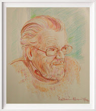
Since I last posted, Kenn Pearson, for whom I acted as election agent in the 1987 General Election, has passed away at the age of 75, having been in serious ill-health for some years.

I noticed today that Mr Abdul Mateen, of Cowes on the Isle of Wight, who stood against Kenn in his Council ward, has paid tribute to him in the County Press, the island's local newspaper.  I wonder how many former candidates would do that - but then, Kenn could unite friend and opponent: he didn't make enemies; he was too nice a man.

I found a drawing I made of Kenn which must date to round about the time he stood as Labour candidate for the island - I don't remember why I did it; perhaps it was intended for a leaflet, though we went for photographs in the end.  Perhaps the reason why will be obvious but, for better or worse, here it is.


Wednesday, 18 November 2015

And we are 65!

Oh goody....................


Tuesday, 10 November 2015

My page on the NAPA website

http://www.napauk.com/robertphillipjones.htm

Monday, 2 November 2015

Robert Phillip Jones, NAPA!

I'm very pleased to announce that on October 29th 2015, I received confirmation that I have  been accepted as a full member of the National Acrylic Painters' Association (NAPA).

In his advice, the Director said:

"The selection committee thought your work was well controlled whilst being direct and expressive.  It also shows a good use of natural colour and composition.

"Your work is interesting in terms of both technique and content and we think it would make a positive addition to the work displayed on our website and in our annual exhibitions."

I should shortly be seen in all my glory - well, some of it - therefore on www.napauk.com.

And don't forget my website - still under construction and renovation - at www.isleofwightlandscapes.net.   Ignore the chaotic gallery page for the time being, there are three other pages for you to savour, including - and how CAN  you resist? - my Buy page, which has a selection of current work still available.

Wednesday, 14 October 2015

The Green, Niton Undercliff,: Sea Defences

This is a quarter imperial watercolour - rock armour protects this part of the coast, but was never installed further along: perhaps that's one reason why the Niton to Ventnor road, Undercliff Drive, collapsed, and why it'll take more than patching it up or diverting it to ensure its future stability.

The spirit of the thing is accurate, but I don't go for images that could be photographic - there's the camera, if you want those, after all.


Saturday, 3 October 2015

Goodbye, Denis

Denis Healey - that was a life well-lived, and you'll be missed: politician, photographer, painter, soldier, and brave man.

A unique combination of intelligence, wit, and sheer guts.  Rest in peace, Denis - you were just about the last of the great figures of the last century, and an inspiration in this one.

Saturday, 26 September 2015

Candlestick Tree, Niton Undercliff

This is an 8" by 10" oil, just a sketch of the huge candlestick tree - I think it's a Sycamore - it could hardly be anything else - that has grown into three great boughs of roughly equal girth until they branch out about half way up.

I've had four paintings so far from this one walk down the road, 3 oils and 1 acrylic.


Friday, 25 September 2015

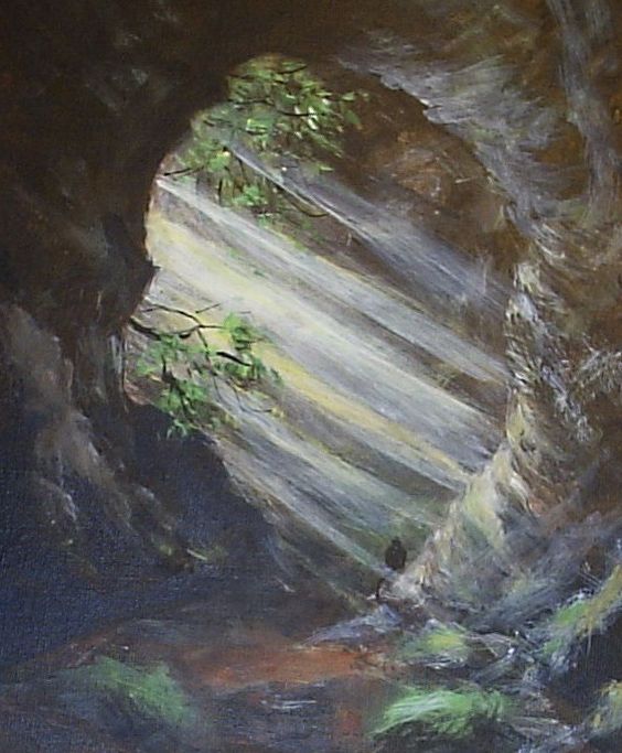
Inside Elephant Hole Cave

Acrylic, 8" by 10"

A quick study from memory, because drawing inside the cave was impossible (not least because I forgot to take a pencil with me....) and so was taking a photograph.  Having got in, the worry was whether I was going to be able to get out again.  The point from which I would have been standing in this one is where a tunnel leads through the cliff to another opening which is almost impossible to see from the outside.  I got through that, but the path was so treacherous that unfortunately I had to turn back the way I came.

Well, I can say I've done it now, anyway: I'm in no hurry to do it again.  I just hope that road works which are likely to be undertaken in the area don't destroy this part of the cliff and its environs forever.

Cripple Path II, and Elephant Hole Cave


A couple of recent oils - the top one is another version of the Cripple Path, from the cliffs down to Undercliff Drive near Ventnor - and I think it's a bit cold: I may add a warm glaze (of transparent oil colour) in places.

The second is of the quite remote Elephant Hole Cave, also off Undercliff Drive.  This, in the appropriate season, is the home for rare bats - there is some concern locally that the road will be diverted all too near to this site, disturbing the bats and destroying a unique bit of landscape which, once gone, can never be replaced.

Sometimes any painter must feel like the Yorkshire artist John McCombs - getting to these places just before the bulldozer.

Saturday, 12 September 2015

Cripple Path pastel sketch

I don't do pastel, other than in sketches for paintings, and I don't do it for public consumption because I'm not very good at it.

I had rather resigned myself to this, and to using pastel merely to take colour notes and to help me "read" a scene before painting it.

However, here is one - not a great work, but presentable; it sort of works.... whether I shall experiment further with pastel I don't know, but it does appear that - at last - I might even be getting the hang of it.

This is a path from the top of the cliff down to Undercliff Drive in Niton Undercliff - the broken road between here and Ventnor.  The term Cripple Path is said (by some at least) to derive from water courses rather than disability, but as yet I've been unable to determine the truth of otherwise of that: what I do know is that I could only get half-way up the path before having to turn back - it's just too steep, and too slippery.  This view is of the last part of the path before it meets the road.

I've just painted it in oil, from a somewhat different perspective - it's a work in progress at the moment, though - not sure about it as yet .....

Wednesday, 26 August 2015

Acrylic comparison, and a new watercolour (when I said I'd stop..)

Here is a (Chromacolour) acrylic version of the not very good watercolour below - just to show the comparison between the two media, and that acrylic can be used in what Alwyn Crawshaw called a "watercoloury way".


From Headon Warren to Tennyson Down.

I'm not sure this is really finished, frankly - but while it's a bit more topographically accurate than the watercolour version, I got a bit bored with it.  Looking at it in thumbnail proportions prior to posting, I think it could do with darker tone in the greens in the right middle ground: but that would have brought about several more problems in relation to the fence and the purple of the heather, and on the whole - well, I wasn't in the mood to do much about it beyond this point.  So it'll have to stand as is, or go down fighting.

And although I swore I would take a temporary rest from watercolour, I got a tube of Pthalo Blue from Jackson's, and had to try it - from which grew another painting: see below......

By the River.

Quarter imperial watercolour  (ie, 15" by 11").  I hadn't intended to paint this at all, just to try out the Pthalo Blue, but it's such a gorgeous colour, and mixes so well, that it grew under the brush.  For good or ill.....

Sunday, 23 August 2015

Two rather dull paintings - We must move on!

The problem with remaining stuck in a groove is that the quality of one's work doesn't get better through sheer repetition but tends to slide downhill.

These are two that slid.

I don't believe in hiding the duller stuff from people, because with any luck we can all learn something from the ones that didn't come off - possibly rather more than we learn from those that did.  And you never know, somebody may have a higher view of these than I have: if so, don't hesitate to make me a foolishly generous offer for them.  I'll pack them up with devoted care and speed them to  you.  But if these were by anyone else, I'd find them dull - and in both cases, the composition is the big problem.


In this one, for instance - which started out as a watercolour but has had a bit of work done  ( not plastic surgery, but a touch of ink and coloured pencil) - we've got a rather unexciting subject to start with, made worse by that lump of blue sea which just isn't doing anything.  I don't think that composition was ever going to work, and the fact that it looks a bit like a stage-set isn't helping: it looks like scenery, rather than a scene, if that makes any sense.


The second one, which is all watercolour, is perhaps a little better -  the reason I'm disappointed with it, though, is its departure from the actual scene;  the distant downs are nowhere near as prominent, nor as symmetrical, as I've painted them.  It was, to be fair to myself, a test piece on which I tried a brand of watercolours new to me (daveliou: made in China, available on Amazon.  The paints worked fine, once I got used to them - this isn't the place to go any further into that, but you'll find my review on Amazon UK if interested).  It's also a bit on the "tight" side - a freer hand with the brush might have paid off here.   The distant buildings are out of proportion, as well, giving a slightly weird impression of scale: it would have been better to have left them out.  

Thing is - one lives and learns, all the time: if you make a mistake in watercolour it will show because it's very hard to conceal it; certainly, if you make a mistake right at the preliminary drawing stage, you're on a loser with watercolour because there's so little you can do to put it right.  Better to scrap the drawing and start again: the trouble is, one doesn't always notice at that stage.  Which is a good argument for making lots of sketches and studies before you ever get round to pulling the paints out.  

I've taken watercolour about as far as I can at the moment, certainly on this paper (Fabriano 140lb).  Flogging away at it isn't going to help, so I've bought some more Chromacolour acrylic, and will be painting in acrylic, and oil, for a while.  I'll certainly come back to watercolour: but I need a rest from it for a few months.  (Trouble is, it does tempt you back!)

Friday, 7 August 2015

Two More

Idleness being foreign to one's nature - pause for mirth - I have two more watercolours to offer: one being rough and, I think, energetic, the other involving a complete change of palette - I watched one of Charles Evans' demonstrations on YouTube the other day ... I know he's an artist who demonstrates on behalf of Winsor and Newton but I think his comment that you  should only ever use artists' quality paint is right: I've been experimenting with some other brands recently, and next to W & N artists' quality they just don't work.....

You might wonder why not - it's true that a good painter can make use of just about any materials, from student quality paint to tea or coffee used as dilute ink.  But while cheap and cheerful materials are easier on the pocket in the short term, they just make life so much more difficult that it takes a lot of the pleasure out of painting.  Colours aren't intense enough - paint has a sluggish tendency and pronounced unwillingness to spread on the paper - and to cap it all they fade.

Good paint makes good work possible: it doesn't make it inevitable, but at least you're giving yourself a chance - working with inferior materials, be that paint, brushes, paper, canvas, just makes the job so much harder than it need be: and in the end, there's no saving in that.

Use the best you can get.

The Broken Wall I -
ignore the gum strip at the bottom!  Must invest in a few mounts....  This is the rough and energetic one.

The Broken Wall II -
And this is the different palette: principally in terms of the yellows; I've not used Lemon Yellow for some time, but employed it here; and I also used Venetian Red rather than Burnt Sienna as my red-brown.