Thursday, 30 September 2010

Taking a Risk!


I'm posting, for the first time, a work in progress: I just started this painting today, in oil on canvas-covered board, all for your benefit...... That is, you can see how ghastly a painting can look in its early stages, and you'll be amazed by its transformation later, when finished!
Um.
I hope....
It's a bit of a test for myself, too; if I post it in this state, I shall just have to finish it and not scrape it all off and start over; again - I hope.
What I've done so far is rough in the sky with a mix of cobalt blue, cadmium red deep, raw sienna, a touch of Naples yellow at the horizon, and Flake White. The greens are mixtures of cobalt blue, Indian red, Raw Sienna, and Indian Yellow, with touches of white at this point. And I've scraped some drawing in with a colour-shaper: which is basically a brush handle with a semi-rigid point on the end of it (and can I remember what it's made of, when I most need to know? Of course I can't. A synthetic substance, not unlike firm rubber, is the best I can do. )
They're made by Forsline and Starr, and are widely available in a range of sizes and different degrees of firmness, and are somewhat more responsive than just using the wrong end of a paint brush.
I shall let it dry out a little bit, or rather allow the paint to get a little tacky, which provides a good basis for the next coats of rather thicker paint. And I may glaze transparent colours over parts of it when it's touch-dry. The scraped-in parts will of course be painted over: they're a guide more than anything else; the ridges of paint created by the colour-shaper can be quite useful in textural terms.
Although these canvas-covered MDF boards I've been using are both durable and cost-effective, I'll be looking for a canvas with a rather more pronounced weave next time: and if I can't find it, I shall have to revert to stretched canvas, which is considerably more expensive; I've never been too happy with working on very smooth surfaces, in oil, watercolour or acrylic - in oil especially, the paint tends to slide about too much. If anyone's got any idea where I can get hold of affordable canvas boards with a good "tooth", let me know. (By affordable, let us be honest, I really mean cheap - but not tat!)
Right then: watch this space - it's going to take me a week or so to finish this, given oil's slow drying time; and if a better version of it doesn't appear, you'll know I've failed humiliatingly.
Make allowances for the flash, by the way. The final version will be a better photograph, if not a better painting.
Isn't modesty an attractive quality?

Wednesday, 15 September 2010

A new one

I've returned to oil paint for my latest. This is the best photograph I've been able to take of it so far, but the colour is a little more intense in the real thing.
I built this one up from an underpainting of Flake White with Mars Brown and some Prussian Blue, on a canvas board primed with Gold Ochre acrylic, applied with a knife. The idea was to give some random texture, but on reflection the oil paint itself is capable of giving that, and in future I shall go back to my old method of applying a thin coat of reddish or raw sienna oil paint, thinned with mineral spirits. The acrylic in the end gave me more problems than advantages.
Haven't got a title yet; it's an area of countryside just around a few corners from here, this path leading up to cliffs which culminate at Rocken End, Niton.
Building up a painting from thinly painted underpainting, in just a few colours (or even just one) is a very traditional way of painting in oil: you can paint over the top when it's dried a bit, with opaque colour, which is what I did here, or "glaze" over a more carefully finished underpainting, with transparent colours; or you can combine the two. The important thing to remember is that there has to be more oil in the top coat than there is beneath it - or you find the paint cracking. Similarly, you really need to avoid at all costs any slow-drying (and therefore oil-rich) paint in the underpainting, especially Zinc White, Titanium White (unless heavily thinned), or Ivory Black.
I used a little Viridian, ie a tube green, in the foliage - just laziness on my part, which I regretted later. Not that Viridian's a bad colour, but mixing green, from blues and yellows, nearly always produces fresher results.
Ah well. You live and learn - which is what this business is all about.
This painting is 30 by 40 cm; not on my website yet, but for sale at around £100.
By the way, I have some work available on Affordable British Art, a website that offers facilities for artists and buyers. Find it at www.affordablebritishart.co.uk
Back soon!

Wednesday, 18 August 2010

Bob Ross: no offence, honest!


Well, not that honest... I've had a little spat on the Painters' Online website. Suggested that one of the paintings posted was very obviously of the Bob Ross school; the painter herself took no offence, and very reasonably pointed out that she might never have started painting at all if it weren't for the Bob Ross workshops locally. But another contributor, I think it's fair to say, did take offence; not least because I had (I thought rather gently) suggested that a previous painting of hers might be improved.
Tricky business, this art criticism lark. The wise man eschews it. A word, though, about Bob Ross. He was a US ex-serviceman who took up painting, had a tv programme, and pursued what he called wet-in-wet oil painting, which involved laying a coat of very liquid titanium white on a canvas, and painting into it with colour. As a method, there's nothing very special about it, other than that if you aren't careful how much oil you mix with the initial coat you run the risk of the paint film cracking later on. Or yellowing. Or both. It isn't so much the method of applying the paint that's the problem, as the utterly predictable results the Bob Ross approach produces. He very rarely painted from life; most of his pictures were entirely from his own imagination, and his imagination seemed to live entirely in Alaska, where he had been based when in the forces.
And so he became a virtual production line of basically the same half dozen paintings; which wouldn't matter so much except that all the Bob Ross "instructors" throughout the world (it's turned into a big business) just replicate these not very good paintings; and their students produce versions of those same paintings; and so you seem them everywhere, lovingly crafted no doubt, but of a landscape which they've never seen... So you get the sea with waves formed in exactly the same configuration as the master employed; trees that are ... well... Bob Ross trees, rather than any species you could identify.
I don't complain if a painting isn't very good; some of mine aren't brilliant (feel free to contradict here); but I don't see any point at all in just copying a copy of a copy of a work that wasn't all that great to start with.
If you see a painting - and you must have - of a range of mountains with a lake in front of them, a yellowish/pinkish sky, trees of a sort of indeterminate breed, and grass painted as though it were minced leaves of cabbage, you have a product of the Bob Ross school. The method goes round in circles and gets nowhere; and what annoys me about it is a) that the students learn nothing worth knowing, and have to make a real effort to break with the method if they're ever to produce anything original of their own, and b) that the instructors within the great Bob Ross empire get to put CRI (certified Ross Instructor) after their names, as if it were an academic qualification.
Now, Bob Ross was not a bad man; from all I've read of him, he was a very good man, and died tragically early. He was an engaging broadcaster, in the sense that he had an extremely relaxing voice and friendly, approachable manner. But - he has been, in my not so humble opinion, an appalling influence; his tutors perpetuate this influence; and I wish there were other places for people to go to learn how to paint well. Under present economic conditions, night schools, tech college courses etc are thin on the ground. And you can't blame - even I can't blame - the Bob Ross empire from filling in the gap. But those wanting to learn to paint would do far better to buy a good book, or subscribe to one of the several art magazines, than sign up to good ole' Bob and his "happy little tree" approach to painting.
Still; each to their own, I suppose...
Welcome, new followers: together, we shall conquer the World!!

Sunday, 8 August 2010

Latest effort, and welcome to follower(s)


Well, here we are again. I see I have a follower, and he's very welcome. I've been struggling with an acrylic/Chromacolour - it gave me enormous problems, partly because I've been working on a rigid support, a ready-made MDF sheet with canvas glued to it; it has many advantages (ie, cheapness!) but I feel I'd have got on much better with a stretched canvas. I'm not sure that canvas glued to MDF has much to offer over plain primed MDF; although a rougher weave of canvas would have helped, I suspect. Any opaque painting technique needs some "tooth" in the support - stretched canvas provides this, as does roughly primed MDF or hardboard (which they call Masonite in the USA).
On the Painters Online website, I've suggested that painting is not something which one needs undertake in any kind of hurry - there is no virtue in completing a painting at any particular speed. My latest, which I shall attempt to attach, is an example of this; it required a large amount of scumbling and glazing; it may have lost a little in terms of spontaneity, but in acrylic you either go for the immediate impression, or a more considered approach; not sure that compromises between the two work very well.
Anyway, here it is; a view of Knowles Farm, Niton Undercliff, Ventnor, Isle of Wight; the range of cliff in the distance is Rocken End, and I've taken some liberties with the topography, on the grounds that, if you want accuracy, take a photo.
By the way - I paint in watercolour, acrylic, and oil; it may be that I would do better to concentrate on one of these, but I've seen no real need to limit myself: and anyway, a change is as good as a rest - I think. But, if you have a different view, let me know. Can't guarantee I shall agree with you, but I'm always interested in others' opinions.

Wednesday, 14 July 2010

Watercolour myths


Here's a painting in which I tried to do things you're not supposed to be able to do in watercolour - namely, taking things out, painting light over dark, using opaque paint. I may have got a bit more interested in the process than in the finished product - don't know. Need, as always, time to think about that. But I think it's more or less what I intended to do - not something one can ever be too confident of achieving in any medium.
There are tutors who will tell you all of the above "don'ts" in watercolour; adding, with insufferable smugness, "of course, we don't use white in watercolour" (or black). What they do tend to employ, however, is masking fluid - which I loathe; not only because it destroys brushes, but because it can give a dangerously cardboard cut-out look (although in the right hands, it can work brilliantly; I'm just a bit prejudiced).
Well in this painting, which for the moment we'll call The Path, I included detail and washed it out again - I defy you to find it. I didn't use white, and in fact rarely do, but did employ Naples Yellow, which contains white and is thus opaque, and mixed it with Cadmium Yellow, which is also more or less opaque (no watercolour is totally opaque, but these two are more so than most). And using these opaque yellows, I painted light over dark. I did plan the painting - so didn't just slosh the paint on and hope for the best. But I like to think I broke most of the purists' rules, without using any kind of masking.
Sheer devilment - I do hate to be told what I can and can't do, in painting and in anything else.
This is, of course, a watercolour, on Bockingford 38 by 28cm 300gsm Rough.

Sunday, 11 July 2010


Sometimes I worry that I'm losing my marbles entirely; this morning, for example, I completely forgot how to access my blog... didn't have a clue what to do. For anyone impressed by the fact that I maintain a website at www.isleofwightlandscapes.net, I have to confess that a friend does it all for me... you can guess why. Unfortunately, his computer is currently down - so there's not likely to be a huge amount of activity going on there, just at the moment.
Oh dear.... typical artistic temperament and mentality, or senile decay? Could so easily be the latter.... And I'm not (quite) 60 yet...
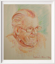
My friend the novelist Edward Upward, on the other hand, was entirely in control of all of his faculties until the last few years of his very long life - 1903 to 2009. I sketched him from a photograph (courtesy of the Allinson family) the other day, and although it's a touch on the cartoon side, I thought I'd show it here, as a mark of affection for a man I'll never forget. Google Edward Upward and you'll find a website devoted to him, on which appears the full text of his greatest work, The Spiral Ascent.
While I'm at it, I'll also show a recent watercolour - Walking the dog turns to running from the storm; one of my dark ones....
Did I mention that all work is for sale (I just bet I did.... email me at robertjones@ratville.freeserve.co.uk - why ratville? I used to keep rats. Splendid things; you should get a couple.

Friday, 25 June 2010


I have a blog, and gallery, on the Painters Online website, linked to The Artist and Leisure Painter magazines - anyone interested in painting would be interested to join the forum there, and contribute their own thoughts and images. Visit it as www.painters-online.co.uk.
I seem to be working mainly in acrylic at the moment - my most recent is maybe just a bit "busy", but - well, I don't know; I'm told people like it. Would be good if someone would prove that by buying it, but we mustn't ask for the moon: we have the stars!
I've moved a long way from the limited palette ideal - the idea being that the fewer colours you use, i.e. tubes of colour, the better. But I'm trying a very limited palette in my latest, on the easel now, of White, Alizarin Crimson, Cadmium Red, Burnt Sienna, Gold Ochre, Cadmium Yellow, and Ultramarine. Even that is more than some would use; and I doubt I shall be able to restrict myself to this list - I feel the hand straying to other colours. Discipline! Let discipline be our watchword....

Tuesday, 1 June 2010

Starting Out


Time to enter the 21st century, I thought. Heaven knows, I've been putting it off for long enough. This is the first entry to what I intend to be a continuous blog, promoting my wares or trying to, and offering, now and then, a few suggestions that other painters might follow, or anyway think about. I've been painting in oil and acrylic for many years, and relatively recently began to get serious about watercolour, too. If I can share some ideas on the basis of my own experience and knowledge, and get some useful feedback, this enterprise will have been worthwhile. As a start, I'll show one of my more recent paintings, which, just to be difficult, is a bit untypical - an oil on canvas of the Gap of Dunloe, in Ireland rather than in my native Isle of Wight. See more at www.isleofwightlandscapes.net - more later.